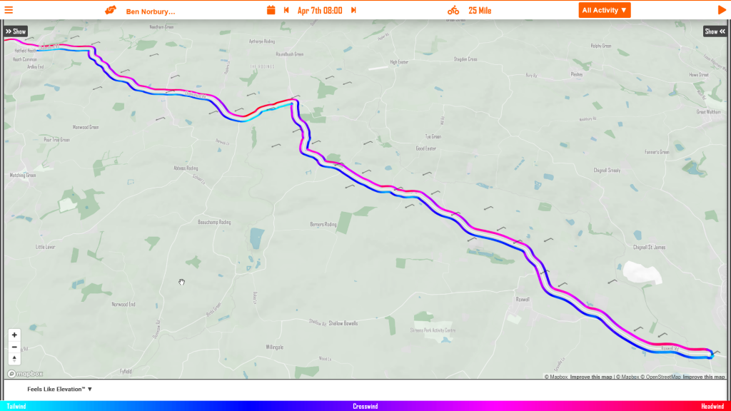
The Wind Lines on the myWindsock map give you an intuitive view of the course and the prevailing wind direction. The Wind Lines are colour coded blue for tailwind, red for headwinds. See the wind arrows, they show the wind direction and the wind speed for all locations on the route. See wind arrow icons for more details.
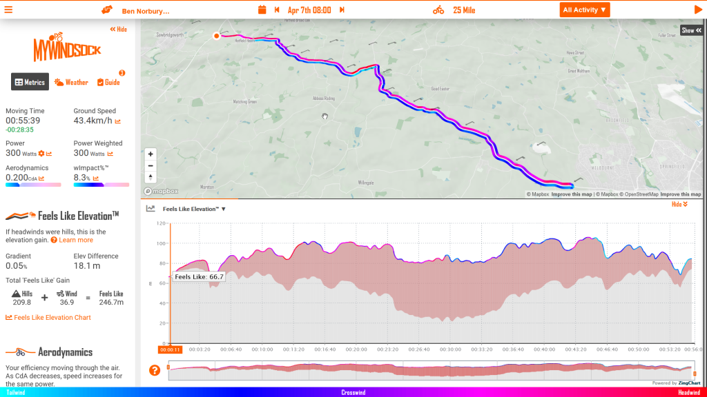
2. Feels Like Elevation
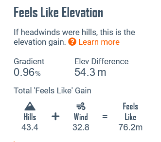
Knowing what to expect is a crucial part of your pre race preparation. The Feels Like Elevation chart is the perfect chart to describe how the road will feel when the elevation has been adjusted for the wind resistance. You now know just how the road will feel.
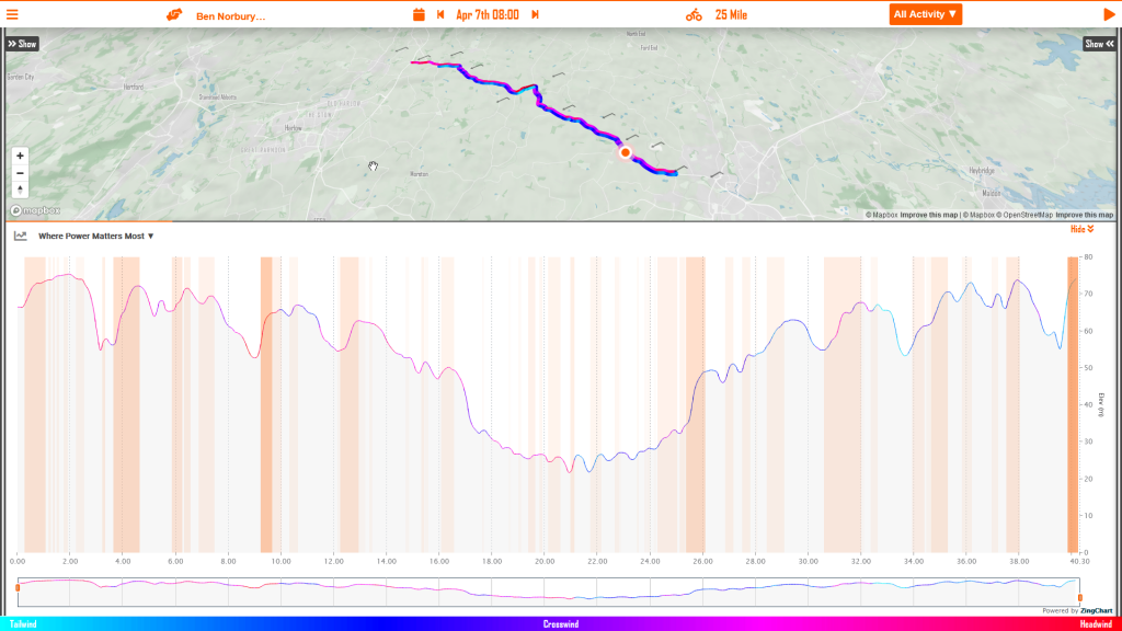
3. Where power matters most
Knowing where to focus your precious energy is a crucial part of time trialing. This is where the chart “Where Power Matters Most” is a vital tool in your pre race preparation. The orange sections on this chart show where power has the greatest affect on your time. The deeper the orange the more important those Watts are!
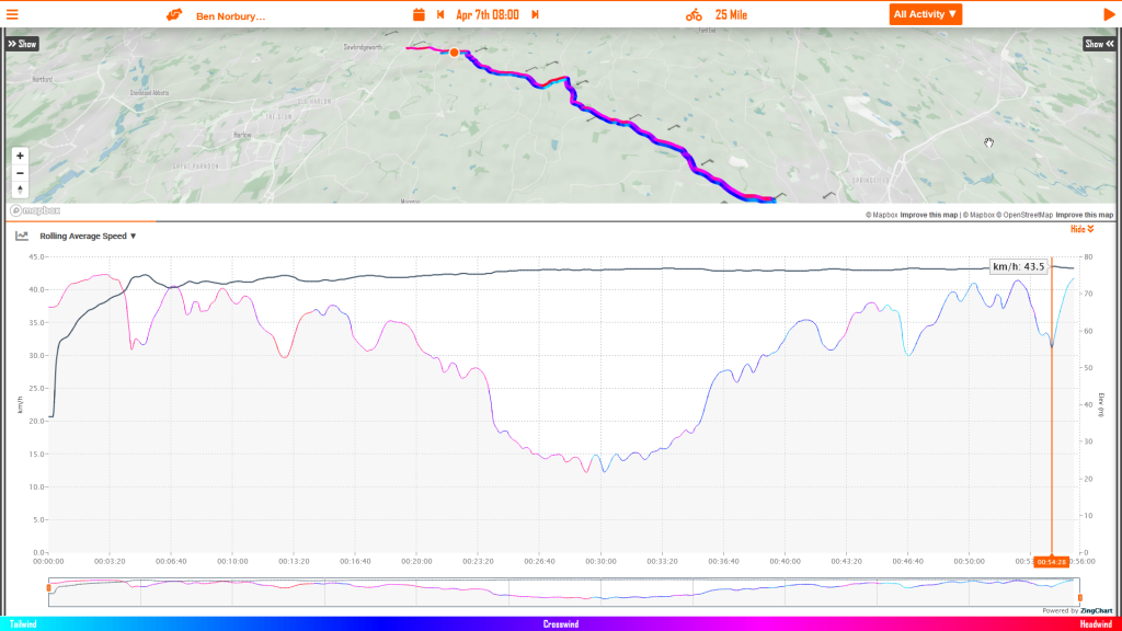
4. Rolling Average Speed
Now this one is for your Chimp, you know that voice that is saying, “you’re going too slow!”. This chart shows how you can expect your average speed to change during the event. For example, an uphill or headwind start will keep your average speed lower than your target average speed. The better way is to understand how your average speed will evolve from the start to finish so you can stick to your plan.
If you’re reading the myWindsock blog, or came across this from our friends over at NoPinz it’s likely you already know what a skinsuit is and you might even be sold on the virtues of their number pocket that saves you watts. If you attend a local time trial, it’s likely the pointy end of the field will be in a skinsuit and these days, most people wear one for all forms of racing. The uninitiated, or even those of you that only take part in the skinsuit wearing because everyone else does, might be left wondering why people wear these? Surely a jersey and shorts is more comfortable? It certainly makes using the bathroom a little easier. We know a skinsuit is faster, but how much difference will it really make on race day?
With great partners like NoPinz, we are able to get a hold of some data that tells us how many watts a skinsuit saves a rider and this can be converted into a change in cda. That’s all fine and good – but still doesn’t mean much on race day. What we really want to know is how much time will this save us today, or on the day of our race? During his hour record attempt, GCN’s Ollie Bridgewood used a NoPinz skinsuit to save himself a whopping 20W. These numbers are seen across the board and a ten percent reduction in drag due to a well fitted skinsuit is commonly seen.
Here at myWindsock, we specialize in turning data into information giving you confidence on race morning. Cycling is an uncertain sport and anything that can reduce the noise in the information that drives your decision making is valuable. By making use of our physics engine, we can calculate how much time a skinsuit will save you on a particular course.
A worked example – the Perfs TT
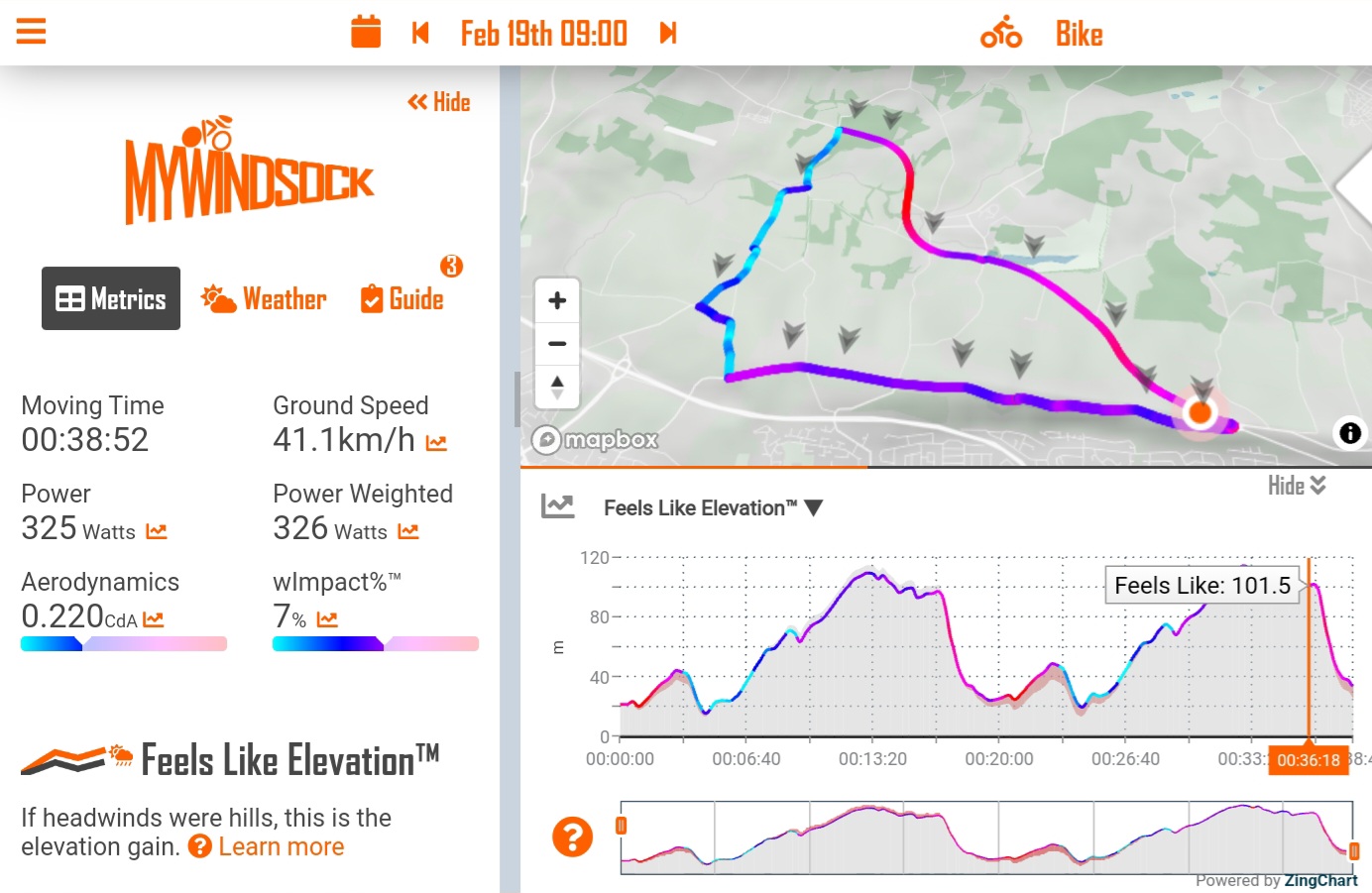
For our simulation, we will use two runs of myWindsock on Sunday’s open time trial which is being held on the Portsdown Hill circuit. We have fixed the cda at 0.220 for the first run and, while keeping all other variables fixed, we will reduce the cda to 0.198 for the second run. This is roughly the proportion of savings a skinsuit will achieve – worth around the 20W that Ollie was able to save with his Flow skinsuit from NoPinz. For this, our test rider is pretty handy – being able to maintain 325W for the duration of the TT with a system weight (bike, rider and equipment) of 80kg.
Test run 1: cda = 0.220
Our rider is coming in at a shade under 39 minutes with an average speed of 41.1kph – not bad! Let’s improve his wardrobe choice slightly and pop him in a NoPinz skinsuit and drop that cda.
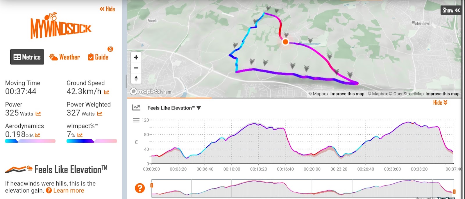
Test run 2: cda = 0.198
The savings are huge, more than a minute! This is just the skinsuit too, imagine the cumulative savings from pacing, optimised position and other equipment choices. Slower riders will also achieve greater time savings for the same proportional saving in aerodynamics. As we can see, a skinsuit is worth it.
If you want to see how the watt savings touted by brands turn into time savings on your local TT course, they’re all available in myWindsock pre-loaded. Just hit Activities & Routes, UK Time Trials, and then scroll until you find your open TT! Or simply go here UK Open & Club Time Trials. On top of this, you’ll be able to see what kind of power is required for whatever performance level you are targeting.
To mark the first British Open time trial of the 2023 season, we were happy to help Cycling Time Trials, the British governing body for time trials, with a bit of data.
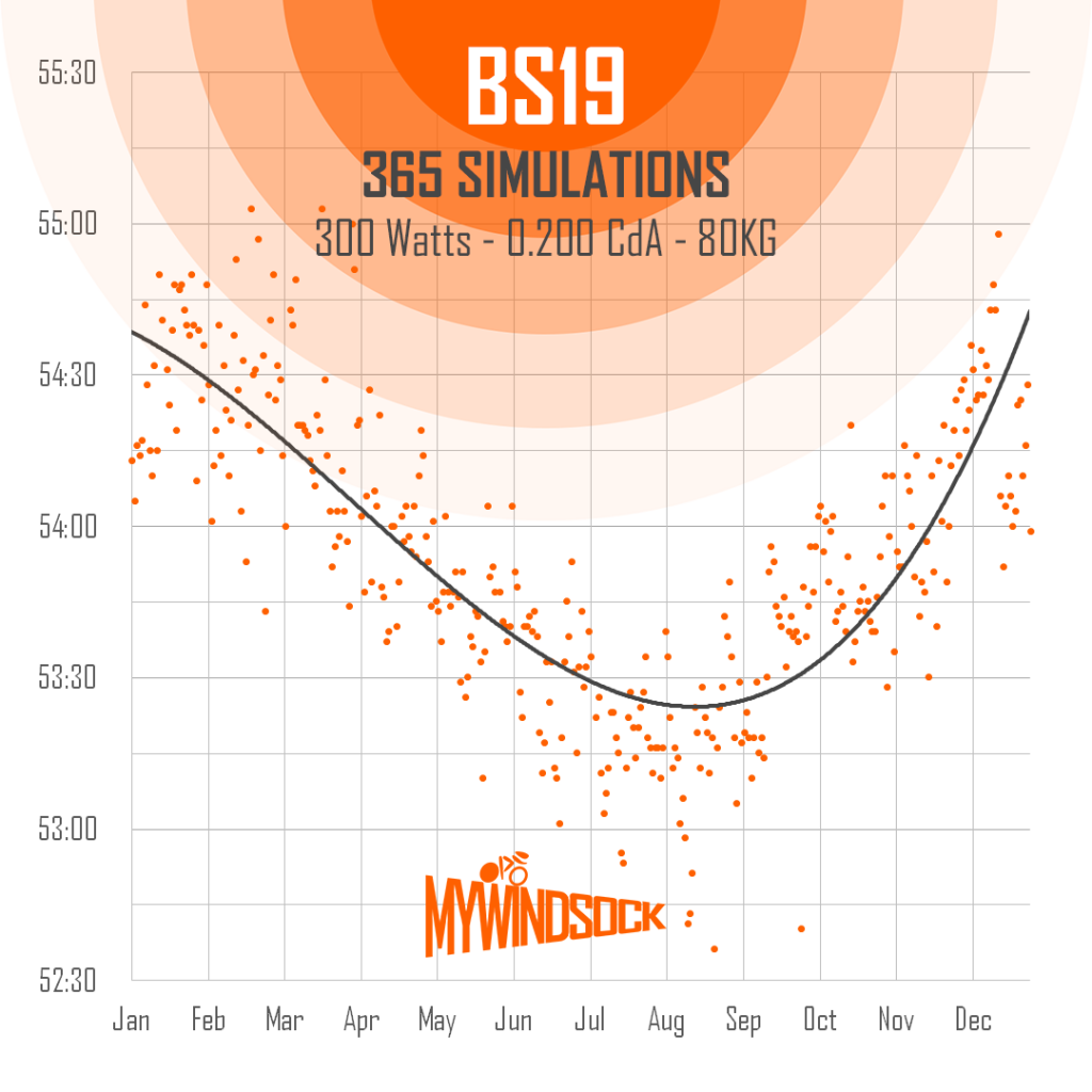
To find out the difference between Winter and Summer, we ran a simulation for every day of 2022. That’s 365 times around the Ely & District course! We ran the myWindsock simulations at 300 Watts, 80kg, 0.200 CdA. Here’s what we found.
Each orange dot is a simulated time based on weather conditions. Each day of 2022 represented.
You can see from the above graph the day to day the variability of times for the BS19 course due to the weather. Time range from 55 minutes in Winter Months to 53 minutes in the Summer.
Another thing to note is the seasonal day to day variability, that is the difference between two days of the same week or month. In the Winter we can see this is around 60 seconds, however times are a little more consistent in the Summer at around 30 seconds. Good job myWindsock give’s you the tools to measure the impact of the Weather.
It’s January which means one thing only – TT season is round the corner (ok maybe it also means other things). Races are popping up from mid February which means some early season form testing is on the cards. You might find that, as a result of a really consistent winter, your power numbers are really good this time of year yet you churn out a couple of slow time trials before it warms up. New kit, new bike fit, more watts and still going slower, but why? Winter time trials are slow!
Rest assured, it’s probably nothing to do with how powerful or inherently aero you actually are yourself and is more to do with the conditions. Of course, by subscribing to myWindsock you will have confidence in knowing this as the conditions are taken into account and you’ll know it was a slow day with high Weather Impact.
Cold is slow!
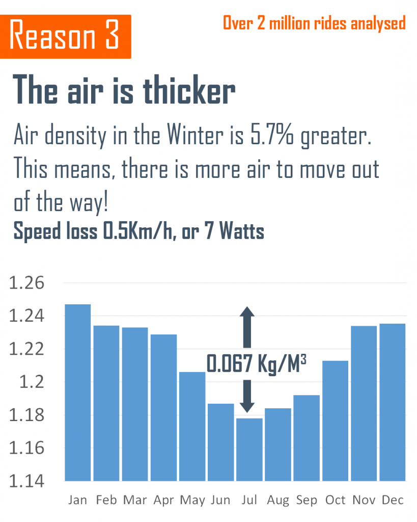
The speed you ride at for a given power on a given day with some given cda is proportional to one over the square root of the density of the air that you’re riding through. This basically means that as air density goes up, our speed will go down. Air density is impacted primarily by temperature. Hot molecules move faster and spread out more. This means more air occupies some given space when it’s cold compared to when it’s hot. In a time trial, the amount of space we need to pass through is fixed at the distance of the race, but the amount of air occupying this space varies quite a lot from one day to the next.
If you have left your house at any point since October, you might have noticed it’s become rather chilly. As time trialists, we think “gosh, the air is rather dense today” and people look at us like we have just started speaking Spanish. Cold days are slow days. It’s just the laws of physics.
If it’s slow, what’s the point of racing in February?
Time trialing is part art, part science. The ratio of art to science will vary depending on who you ask but everyone agrees, to get good at time trials you have to do them. As with anything though, blind practice only gets you so far. Practising with purpose is the key.
What would be handy is some kind of service which analyses your winter time trials and tells you how much impact the weather would have and how aero you are. Of course, you can see all of that information here.
Use myWindsock to dial in your pacing and kit choices so that by the time summer comes around you’re dropping massive PB performances with confidence.
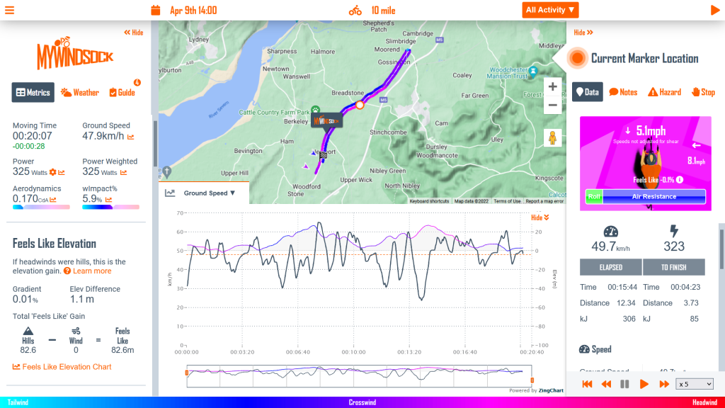
We’re excited for the FTP Racing U7B time trial on Saturday 9th April. This is a quick look at some course dynamics. All charts are correct to the current forecast. We recommend viewing your own forecast, to see the most up to date course forecast and data. View the course and the forecast for Saturday here.
How the course will feel
‘Feels Like Elevation’, helps us to visualise the wind in the same way as we would the elevation profile of a hill. We are equating the wind to the hills. Helping us to see how the wind would feel, by viewing it’s equivalent gradient. This helps us formulate our mental strategy for race day.
Below is the graph for Saturday’s race. The Westerly 10mph wind, is now combined with the elevation profile. The grey area is simply the standard elevation profile. However, the coloured line shows the wind and elevation together to give you a clearer idea of how the course will feel.
The red areas are showing that the wind has created harder feel than the original elevation profile would suggest.
Feels like elevation, when we factor the feel of the wind combined with gradient
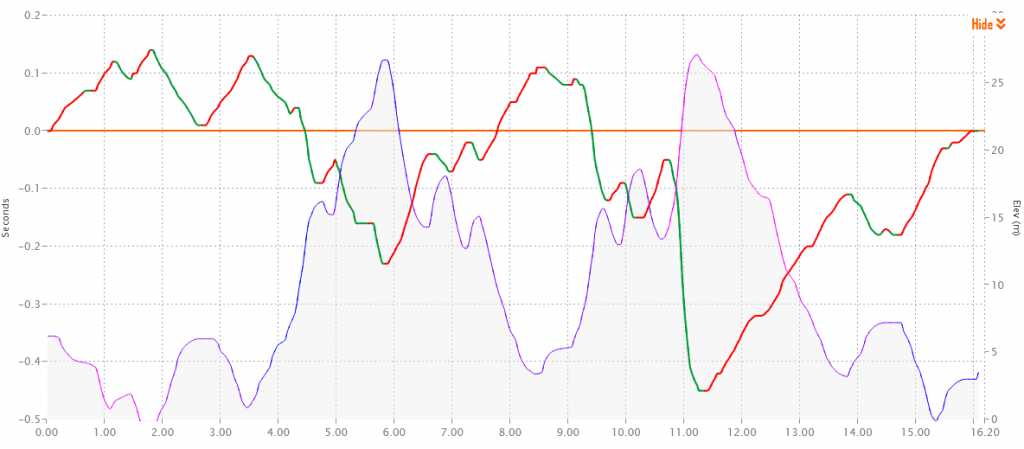
Where should we put more power out
We next turn to where the course will give us the most return, for a little extra power. The green areas of the line chart below shows were on the course we get the greatest return for each additional Watt. Pay attention to 3.5-6km, 9-9.3km and 10.75-11.25km, those locations will give you a good return on a slightly increased power output.
On the flip slide, the red section, will give you an idea as to where it would be less advantageus to increase your power. Looking at 11.25km to 14km, it wouldn’t be as efficient to increase power here. Better to increase the power in the preceeding 0.5km.
Where power has the greatest affect on time. Green shows where you get the most return for each Watt.
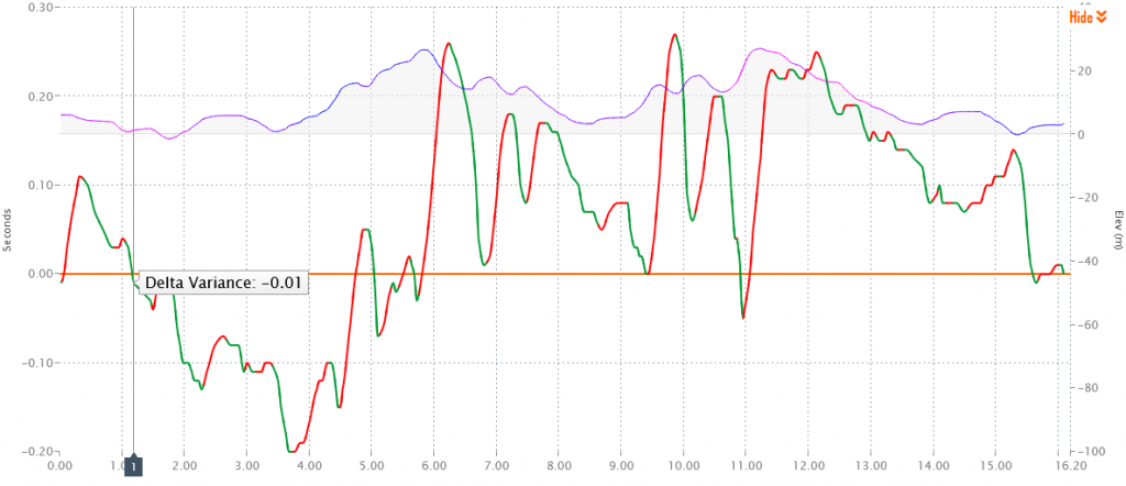
Where aero is most important
Next, where on the course does an increase in our focus on aero pay off the most. This is depicted in Green below. In red aerodynamics are having less affect on the overall speed. This is not to say aero is unimportant in these areas. This graph simply shows that if we were to increase our aerodynamic efficiency where along the course would that increase in efficiency give us the greatest return.
Where aero has the greatest affect on time
You can make your own experiments using myWindsock for all your time trials. We have all the UK time trials already preloaded for you. Simply visit our CTT Time Trial Forecasts.
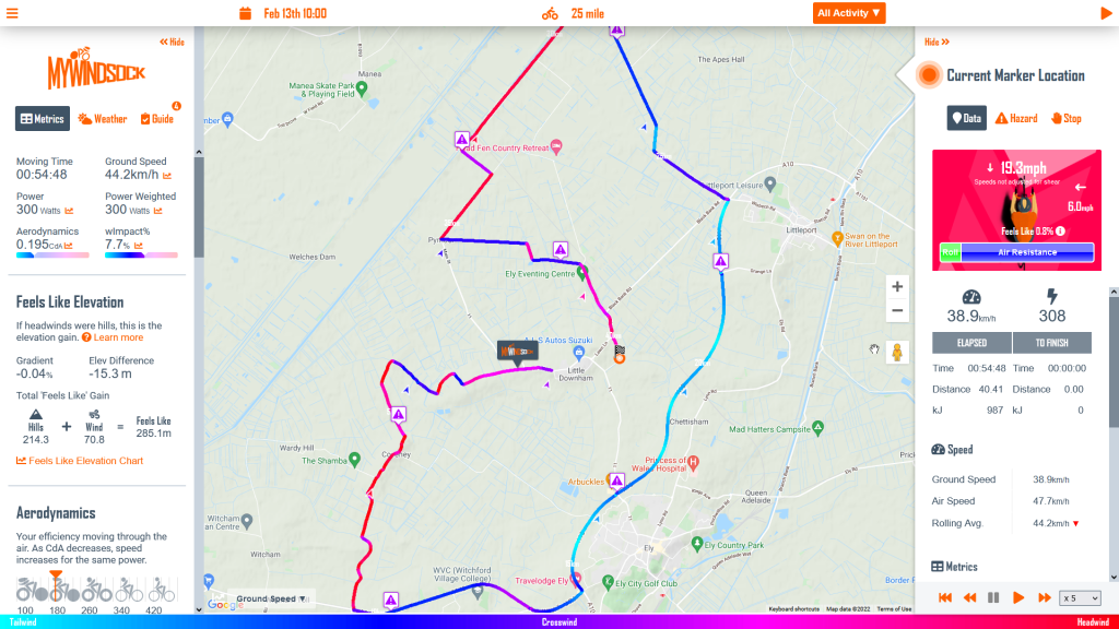
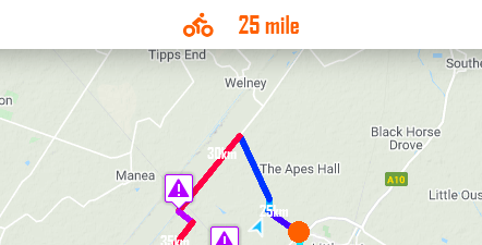
The 2022 time trial season is just around the corner. In this series, I’m going to show you how I would use a myWindsock forecast, to prepare for the first Cycling Time Trial event, the Ely & District 25 mile SPOCO on BS19.
PLEASE NOTE: Weather forecasts are updated hourly, this forecast may have changed from the time this article is published. View the forecast for yourself here.
In this first part we look at how understanding the challenges of the course weather so we can prepare a mental strategy. This is what we refer to as the Descriptive side of myWindsock. We are describing race day, so you have all the information required for optimal mental preformance.
In our second part we will look at the Prescriptive tools. We will show you how to formulate the optimal power plan.
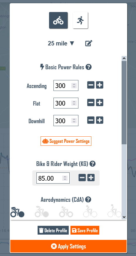
First thing, we need a Virtual Athlete to Ride the Course
We want to ensure everything we are looking at reflects our performance on the day. To do this, we need a Virtual Athlete (VA). Your Virtual Athlete will ride the course as many time as you like, with infinite setup choices. The beauty of your VA, they never get tired!
In the next part of this blog series, we will look at how to use your Virtual Athlete to formulate the best race plan. For now, we just need to have a good estimate of race day performance.
Clicking on the Bike icon for cycling events will reveal the Virtual Athlete menu and settings. Ensure this reflects your own performance.
You may want to create a new Virtual Athlete for this race distance, I have one simply called “25 mile”. I will use this as the basis to begin all 25 analysis and then, as we will learn in the next post create a race specific VA for the event when I come to plan power.
Pay specific attention to Power, weight and aerodynamics.
Often I am asked about what to enter for aerodynamics. You can use this post to find your CdA from a previous race activity. You can also use the icons to guide you. For time trials if in doubt use 0.200.
What to expect
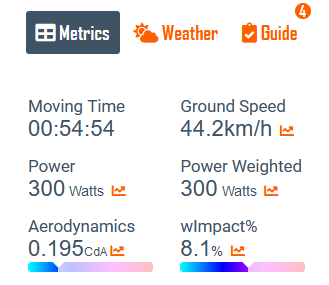
We start in the Metrics tab. My attention is initially drawn to the Moving Time and average ground speed. Notice that we refer to ‘Ground’ speed rather than simply ‘Speed’. This is because we also have metrics for ‘Air’ speed.
Power and Aerodynamics are as we have set for out VA.
Weather Impact is quite high at 8.1%. This tells us, for me to achieve the same time as on a weather free day, I’d require an additional 8.1% power. Find out more about Weather Impact.
General Summary
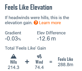
Moving down the metrics panel we have our Feels Like data. Feels Like gives us an alternative way to view the wind. We equate the wind to it’s equivalent gradient. Why? Well, I find it is easier to imagine a how difficult a gradient will feel. Whereas, the combination of prevailing wind direction, wind speed etc. is more difficult to imagine.
Our Feels Like Elevation panel
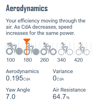
Next, we move down to the Aerodynamics panel. There are two pieces of information we should be aware of. First is Yaw Angle. This is the average Yaw, we have a chart showing the Yaw distribution, to help make informed equipment choices. I have a couple of wheelsets and some technical data on them that gives me the best operating Yaw angles.
Also in Aerodynamics we have the Air Resistance. This is the percent of your power absorbed by air resistance.
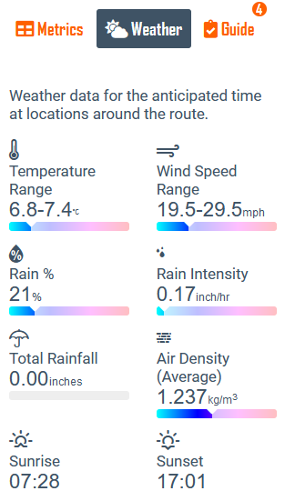
Weather Overview
Our Virtual Athlete has now collected data at the correct speed. So now the data will reflect the correct time and locations for our weather data. Let’s take a look under the Weather Overview.
The above numbers are an overview of the data collected from around the course. It is forecast to be a chilly ride with strong 19.5mph average wind speed, gusting up to 29.5mph. Some rain may be present.
The headline from the forecast has to be the 20mph plus wind, so our next stop is to see where that wind will be on the course. We head to the Course Navigator.
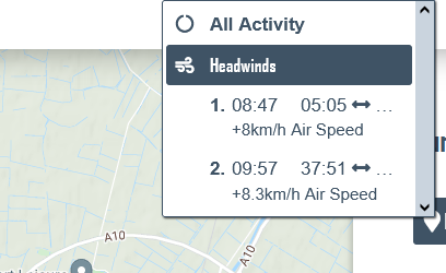
Finding the Headwinds
First thing we note is that there are no significant climbs listed. However there are Headwinds.
Two headwinds are brought to our attention, each around 9-10 minutes in length. The first starts 5 minutes into the ride, then the second almost 38 minutes in. We also note the additional 8km/h air speed, this is quite significant. Why 8km/h. We calculate this additional air speed from the prevailing wind angle, wind speed and wind shear, which is the slowing of the wind close to the ground.
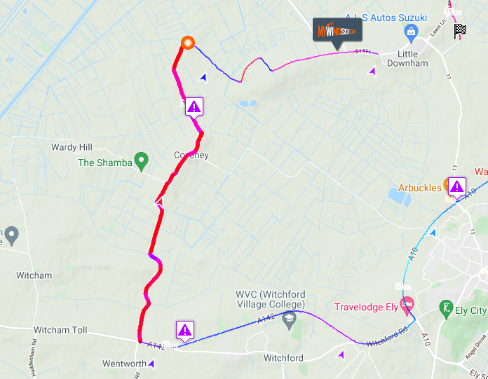
To see each headwind we simply click the headwind we are interest in. This highlights the headwind on the course so we can visualise where to expect the wind to start and finish. This also creates metric summaries for the selected portion of the ride.
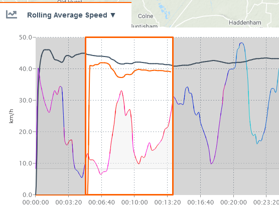
First Headwind 5 minutes from the start, lasting just under 9 minutes.
How to use this data
Why do we need this information? By understanding how the headwinds will affect our performance, we can create an effective mental strategy.
What usually comes into your mind when racing through a headwind?
I’ll tell you what comes into mine.
Sometimes, I can be defiant, “I’m not going fast enough”, “I need to push harder”.
Then there is, “this sucks”, “I’m having a bad race” and “today’s not my day, I don’t have the legs”.
Non of these thoughts keep us in a calm high performance mindset and are likely to sabotage a race performance. To combat these thoughts we need facts as our weapons. This is where our analysis goes next.
By being mindful during a race we can discover what information we need to have. This is personal to you. However, I will outline from my experience what helps me.
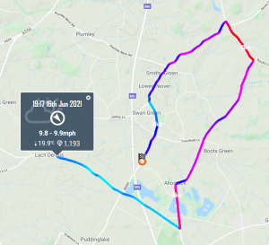
When and where to expect the headwind to start. Use the map and the Course Navigator to ensure we know the start position.
Know what the affects of the headwind will be
Check the Average Speed Graph. How much does the speed rise all fall during the headwind. This helps with any thoughts around not going fast enough.
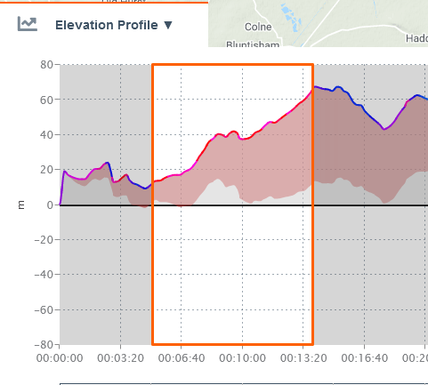
View the Feels Like Elevation chart to visualise how the headwind relates to gradient. You may find it helpful to imagine this theoretical hill you are climbing. Imagine the summit to be where you know the headwind finishes.
Know where and when the headwind will finish
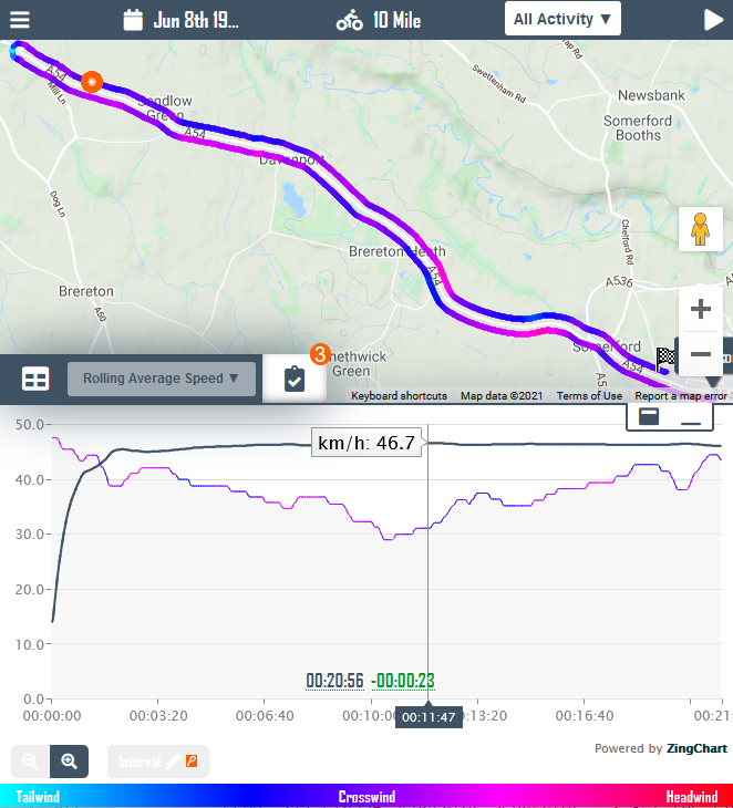
Rolling Average Speed. The Black line indicates the overal ride’s average speed evolution. The orange is the rolling average for the highlighted section.Feels Like Elevation Profile. The grey section is the actual gradient. The red section and coloured line depicts the Feels Like elevation gain due to the wind.The Feels Like Summary for this headwind. It will have an average gradient feel of almost 1%.
We repeat the above for each of the significant headwinds. The crucial part of this planning phase, what we call the descriptive phase, is to minimise the unknowns. I think of it this way, if we were tennis players we would expect to know what court surface we would be playing on. The weather poses as much of the race day challenge as the distance and terrain.
In our next post we plan the optimum power strategy.
Discovering how your weather compared to others in the top 10 of a Segment, reveals the truth about your effort.
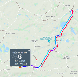
It was my first time out on the JC19 course held by Weaver Valley. It’s a challenging course, mostly due to the Cheshire pot holes putting the word ‘trial’ in ‘time trial’. The result landed me a top 5 on the course’s Strava Segment. That was a suprise! I didn’t feel it had gone paticularly well. So my question this evening is, were my conditions this evening better than the rest of the top 10? Were my efforts flattered by the time trial course’s weather conditions?
The Weaver Valley 10
One of the first features of myWindsock was to compare segment weather. The technology has come along way from simply stating wind speed and direction. wImpact% now shows the percentage of energy required to match the conditions of a windless day. So a wImpact% of 5% simply states that you would require an additional 5% more power to achieve the same time on a weather neutral day. [Learn more about Weather Impact]
So how about tonight’s effort that landed me a top 5 on the Leaderboard. Did I have a lower wImpact% than the rest? meaning my conditions were better. Time to checkout the Leaderboard Weather [Find out here how to do this Leaderboard Weather].
Well a weather impact of wImpact% of 0.8% is very good and as we can see it’s the best conditons of any in the top 5. So I think I can say I chose a pretty good day to go along to Weaver Valley Club 10 to try out the course. Next time out I think I’ll be a little more settled on the bike. My CdA measured 0.010 greater than my most recent events [Find your Ride’s CdA] and my power was a bit low. So it’ll be good to go back and have another trip around the Weaver Valley 10 mile.
In tonight’s race I was hoping to move another step forward with my aerodynamics. In my race plan, Crosswindy JC/27, I was predicted a 21:14. However a complete stop a mile into the race and I still finished with a 21:12, let’s find out why!
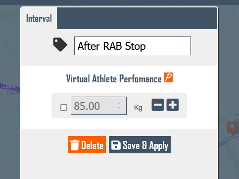
At least my stop was early in the time trial, so I can cut this out and get some decent aero data. I did this by creating a new Interval [learn how to create intervals]. This allows me to isolate that part of the ride and ensure my CdA analysis is not including any of the braking or the strained and overgeared return to race speed.
Am I getting back my aero…
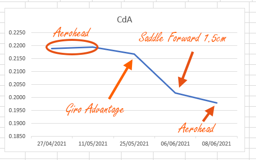
From the start of this season I’ve been struggling with getting my head comfortably low. So I’ve been making some methodical alterations to my setup. Changing just one thing at a time. First of all I swapped my Aerohead to a pointy Giro Advantage helmet. I did this as I felt the helmet’s tail may be the best band aid while I figure out why I can’t get my head below my shoulders. There was a small aero improvement with the Advantage helmet.
I then looked at why I couldn’t tuck my head like I have been able to in previous years. At first I put this down to decreased flexibiity during the off season. I eventually decided this could be due to repositioning the saddle a little more reawards. I did this as I was having issues leveling the saddle. In training I didn’t feel much difference from the change. In racing however I think it could have been a tipping point.
I’ve been using myWindsock CdA analysis of my time trials to track all my changes and the results are measurable. Having raced with my saddle forward by 1.5cm in the Giro Advantage pointy helmet I thought it best to see if it is still the correct choice. [Learn how to measure your CdA]
Success! The more forward position is further improved by returning to my Aerohead helmet.
Sprint finish
In my race planning I wanted to know whether it was better to be out of the saddle at the finish. I decided, from my analysis, the extra power cancelled out the aero penalty. So I jumped on the pedals over the small hill to the finish. It just felt right at the time.
Was it a quick night?
Overall the wImpact% was 1.3% which is very good. In past events on this course the wImpact% has been as high as 7.2% [learn more about wImpact%]. The crosswind added an additional 4 metres of ‘Feels Like’ elevation gain which again isn’t too bad when compared to the additional 18 metres last time at this course [learn more about Feels Like Elevation].
You can analyse all of your time trials or training ride with myWindsock, find out how to get started.
Before our Tuesday evening club 10 I always look up our time trial’s forecast. WIth some experimentation there may be some extra speed available. At the very least knowing what to expect when out on the road is always useful. It’s super easy to do, you can find yours on the UK Time Trials Club Events page. This is where we have listed all the UK’s evening club time trials ready with forecasts.
This week’s forecast
The feature for this week’s club 10, on our JC/27 course is a moderate crosswind. To get the best data for the course I need to update my Virtual Rider with my latest performance data. To do this, I will use the Suggest Power Settings button and Select Best Effort [Learn more about Suggest Power Settings].
This gives my Virtual Athlete a time of 21:14. Whilst the time is interesting to have as a goal for the race, it is more about simulating the race for better data insight.
How will the ride feel?
The first graph too look at is the ‘Feels Like’ Elevation Profile chart. This is how the Wind + Gradient combined will feel. [Learn more about Feels Like Elevation].
A crosswind will often cause Feels Like Elevation to increase across the route, as in it’ll feel harder than a windless day. This is because air moving across you, even if it is not directly head on, still increases the air flow over you and resistance. So this is the case tomorrow, the day will Feel a little headwindy each way. The good thing is that the angle and speed of the wind for the time trial creates just a small increase in Feels Like Elevation across the ride.
Splitting Out from Back
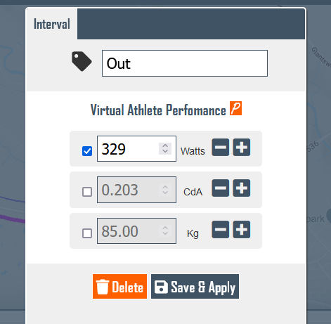
I want to see how a 10 Watt difference between the Out and Back will change the Virtual Athlete’s time. To do this I create an Interval for both the Out and Back portions of the ride [see how to Create Intervals].
Next I customise the Out interval with a 5 Watt increase and reduce the Back interval by 5 Watts. Now let’s see how the reversing the power output to higher Back than Out, changes the time prediction. There is just 3 seconds difference between the two stratgies, not a significant change. However I will ensure I am well warmed up so that I have my top end power ready from the start.
One last experiment…
I’m always tempted to sprint out the saddle in the final minute of this course. It’s up hill and begs me each time to leap out of the saddle. But the speeds are high, still averaging over 25mph. There is however a 50 watt difference between my out of saddle finish and my seated sprint for the line.
So let’s do a little bit of modelling. I’ve entered my aero finish params as below.
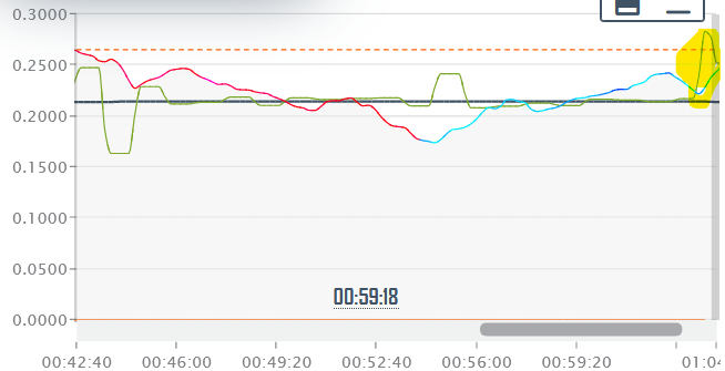
But now I need to modify this Interval for an out of the saddle effort. But was is my out of saddle CdA. Luckily I did succomb to the urge to leave my aero position in a previous TT. So I have a Live CdA line to give me some guidance. This puts me at around 0.280. Not too bad but I am still leaned forward and attempting to maintain some aeroness.
Highlighted finish Live CdA
So let’s put those numbers in 480 Watts with a CdA of 0.280. The result…
Interestingly the 50 extra Watts merely compensates for the loss of aero. So tomorrow I’ll just go with what feels natural, knowing there’s nothing to be gained or lost there on this occasion.
Out of curriosity let’s move the forecast forward to later in the week to see what a 10mph headwind rather than the crosswind would do to the same experiment. This time a slightly different result with a 1.2 second benefit to staying in the less powerful but more aerodynamic position.
Last change delta chart shows the time lost.
How will my average speed develop during the ride?
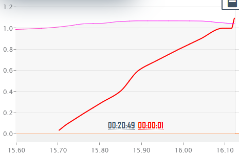
The predicted time indicates an average speed of 46kmh. Now if I went straight from the start expecting to see that number on my bike computer I’d be burying myself pretty deep. This is why studying the Rolling Average Speed Graph is so useful. We want to know how we are doing against the plan. I usually check at the very least my expected average by the turn. [Learn more about the Rolling Average Speed graph]
There isn’t a significant drop from the turn to the finish if all goes to plan, just 0.5kmh. So fingers crossed it’s a case of get to the turn an hold on.
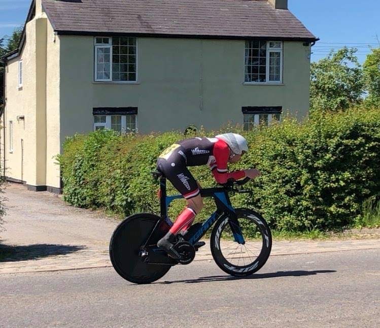
Today’s race was the M&DLCA Invitational. The weather can be summed up simply as HOT! This did mean however the air density would be at least a bit lower than the cooler evening club time trials I’ve been racing. The J2/3 is not known to be a quick course, with the finish 14 metres higher than the start. However, with a South Westerly wind and an Easterly finish, just as we had today, it can offset some of the positive elevation gain.
Aero Check, what was my CdA?
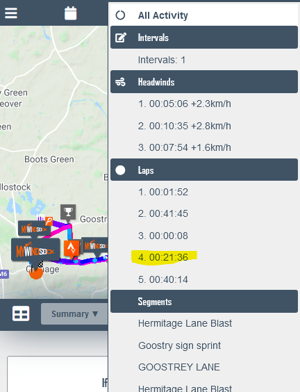
As usual post race, the first thing I look at is my CdA. I left my Garmin running from the start of my warm up, which was actually mostly trying to keep cool, so I need to select the race from the Activity Navigator [Learn how to use the Activity Navigator].
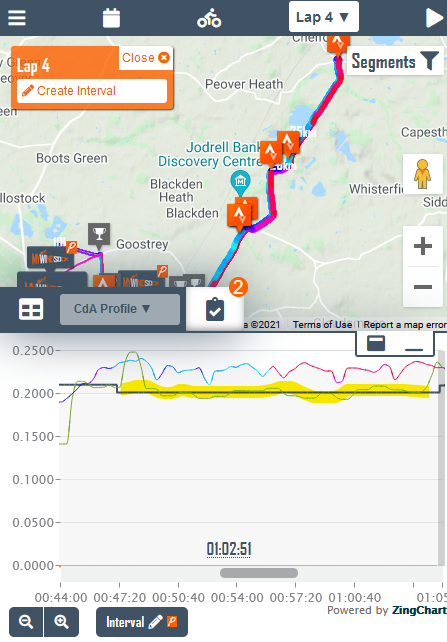
Once I’ve selected my race lap or segment, my summary stats including CdA are recalculated. But the average CdA number can sometimes not give the full picture so it’s always worth viewing the CdA graph. [Learn more about finding a race CdA]
As you can see, highlited line has a small step down. This is usual with an out and back course as the loop that controls the CdA line starts reading opposite on the road to where the ride finishes to complete the loop. So we ignore that first bit of the line. The line reveals I had an average CdA of 0.202.
Since starting back racing my CdA has been much higher hovering around 0.215-0.220. So I am happy to see it going in the right direction with a small saddle tweak and a helmet change.