


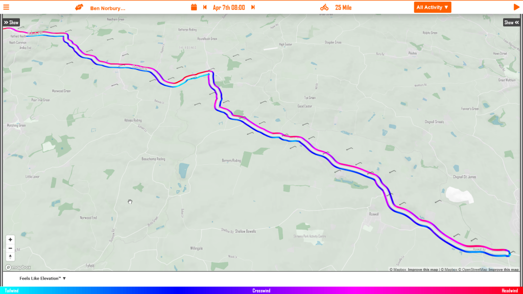
1. The Map
The Wind Lines on the myWindsock map give you an intuitive view of the course and the prevailing wind direction. The Wind Lines are colour coded blue for tailwind, red for headwinds. See the wind arrows, they show the wind direction and the wind speed for all locations on the route. See wind arrow icons for more details.
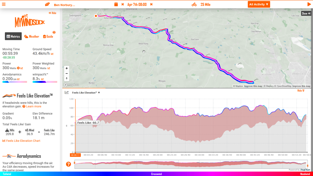
2. Feels Like Elevation
Knowing what to expect is a crucial part of your pre race preparation. The Feels Like Elevation chart is the perfect chart to describe how the road will feel when the elevation has been adjusted for the wind resistance. You now know just how the road will feel.
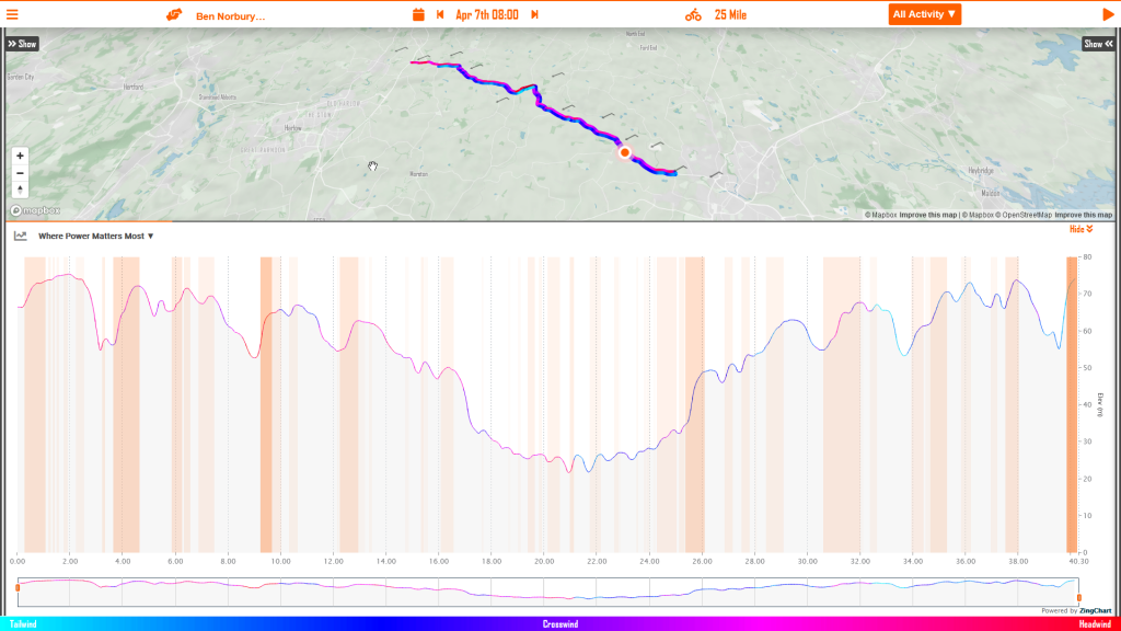
3. Where power matters most
Knowing where to focus your precious energy is a crucial part of time trialing. This is where the chart “Where Power Matters Most” is a vital tool in your pre race preparation. The orange sections on this chart show where power has the greatest affect on your time. The deeper the orange the more important those Watts are!
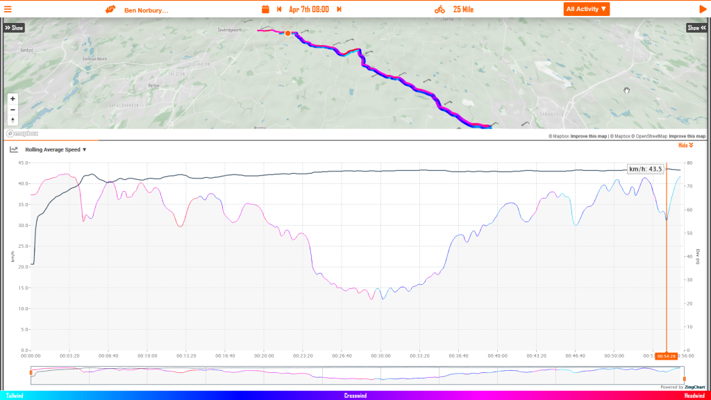
4. Rolling Average Speed
Now this one is for your Chimp, you know that voice that is saying, “you’re going too slow!”. This chart shows how you can expect your average speed to change during the event. For example, an uphill or headwind start will keep your average speed lower than your target average speed. The better way is to understand how your average speed will evolve from the start to finish so you can stick to your plan.
Now to check out your time trial. View you event from the Cycling Time Trials page.