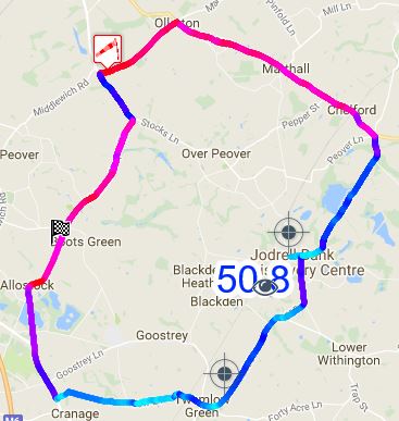

 UK Time Trial Events
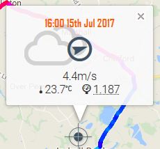
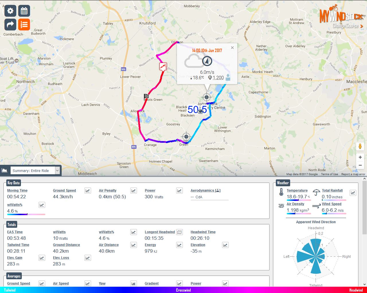
We’ve looked at setting up the forecast and understanding the map. Let’s take a look at some of the key charts for Time Trialists that will help you plan for your upcoming race. Some of these charts require Premium membership, please take a look at all the extra features of Premium including many of these charts here.
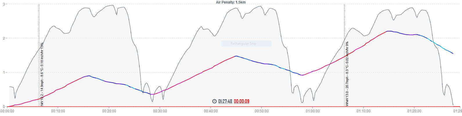
Air Penalty Chart
What is it?
Shows the accumulative air distance. When the graph is rising (headwind) air distance is being accumulated faster than ground distance. When it is falling (tailwind) ground distance is accumulating faster than air distance.
How to use it
Where the AP line is rising expect greater air resistance. A steeply rising line informs you of sections where the headwind is at its greatest. In these sections expect ground speed to be slower. Where line falls there is less air resistance and your ground speed is likely to be higher than neutral conditions. Pay attention to how the rises and falls are distributed before a time trial to set expectations of ride experience. In other words how long will I have to grit my teeth into the headwinds.
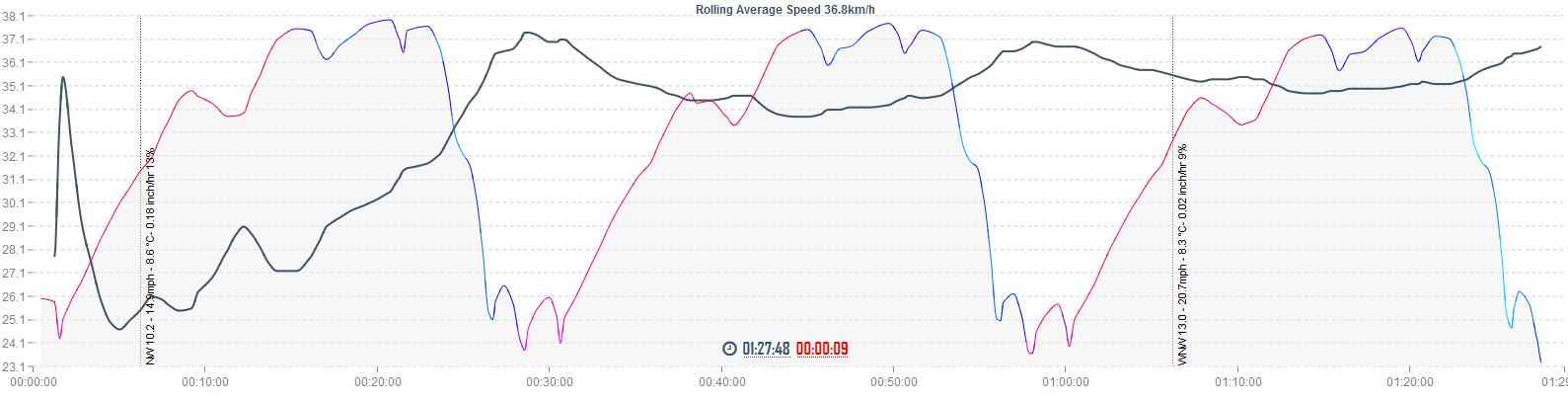
Rolling Average Speed
What is it?
From the Performance settings you have entered in combination with the rolling weather forecast how will your average speed progress throughout the time trial.
How to use it
When monitoring your average speed during a race you should do so in context of how the entire race is predicted to unfold. On courses where there are fast starts and slow finishes your average speed is likely to be higher than your target average. Where slow starts are expected for example hills or headwinds your average speed will be lower than your eventual average. Being up or down on your predicted rolling average will give you a much better understanding of how you are performing rather than your overall target average speed.
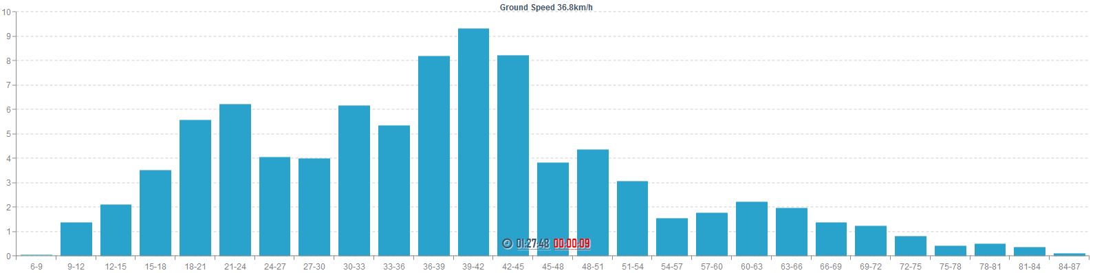
Ground Speed Distribution
What is it?
Displays the predicted speeds and time spent at within each speed range.
How to use it
This chart has many uses and is critical for those choosing to ride a fixed gear. Chainline efficiency on geared bikes can be improved by ensuring the cassette and chainring combination has the straightest chainline when at the speed most frequently encountered. Overall average speed can be misleading when making these calculations as often this is affected by large periods below and above this speed. The highest peaks are key speeds to gear for.
Yaw Distribution
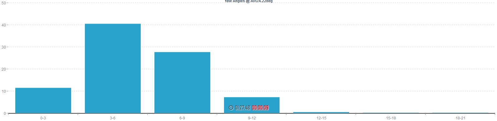
What is it?
The predicted Yaw angles produced by the prevailing wind. A windless day would produce 0 yaw. High crosswinds will increase yaw angles. Increasing a bikes ground speed reduces Yaw angles.
How to use it
This is one for those who have the luxury of equipment selection. Choose the equipment you have available that has been shown to produce the lowest CdA for the most frequently anticipated Yaw angle. For example perhaps the long tail helmet will work better for you on a low yaw day. Where as a stubby tail helmet may be better suited where the yaw angles are higher.
Resistance
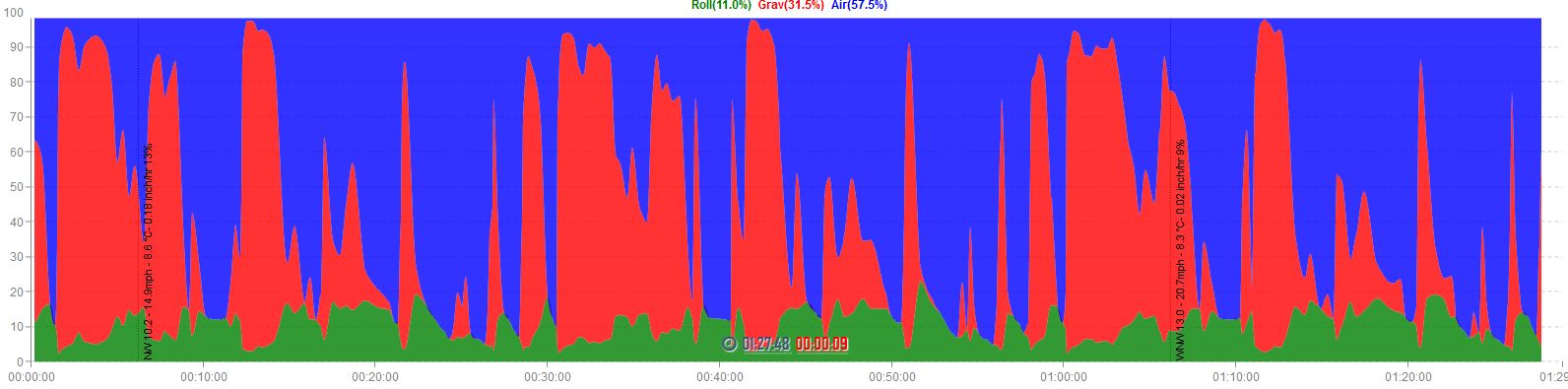
What is it?
Combining course weather conditions, elevation profile and your Performance settings this graph depicts the distribution of resistances working against you along the course. Large Red sections show where Gravitational resistance is high in comparison to the other forces. In flat time trials the majority of the graph will be Blue as Air resistance is greater than Gravity and Rolling. Tailwinds will increase the proportion of Gravity and Rolling resistance to the overall resistance that prevents you going faster. A headwind on a hill will increase the air resistance component and reduce the Gravitational proportion of resistance.
How to use it
Look out for large section of Red (gravity) it may be more efficient to relax your position to avoid restricting power output. A Resistance graph predominantly Blue (Air) will favour a TT bike. If a graph is predominantly Red (Gravity) you may find a road bike set up more advantageous.
Energy Requirement
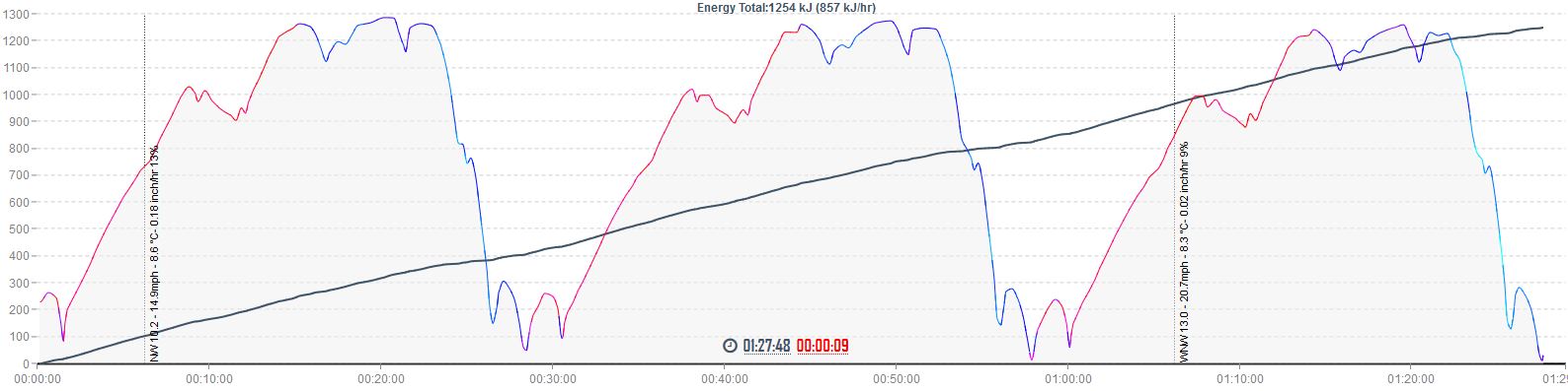
What is it?
The accumulative energy expenditure throughout the time trial. The line will rise steeper where power out put is at it’s greatest.
How to use it
Beneficial to medium and long distance time trials where energy consumption is required during the event. The frequency and quantity of energy intake can be planned from this chart. You may choose to plan your feed stops/hand ups around the predicted times and locations. Ensure you have taken on sufficient energy with enough time for digestion prior to steep rises in energy requirement.