Some of you may have noticed that myWindsock has had a bit of a new look in the past couple of months. Along with our renovation comes a number of new graphs and charts to help you analyse your rides, routes and races. Today, we’re going to go through our top 5 graphs and charts that are new, or revamped, on myWindsock.
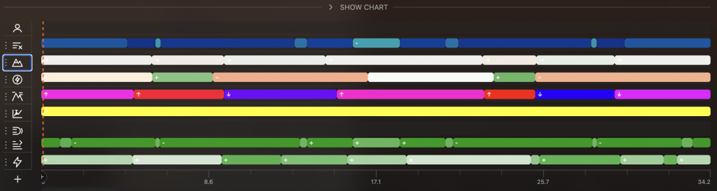
1. Timeline view
The timeline graph allows you to view your ride as you’ll feel it on the road. It includes topographic exposure, elevation changes, power advisor, wind significance, estimated model error, CdA estimates, topographically adjusted wind speed, power settings and more. By pressing the plus bottom in the bottom left you’re able to add new values to the timeline view. The timeline view can be accessed via the arrow in the navigation bar at the bottom of the screen which expands it into what you can see here.
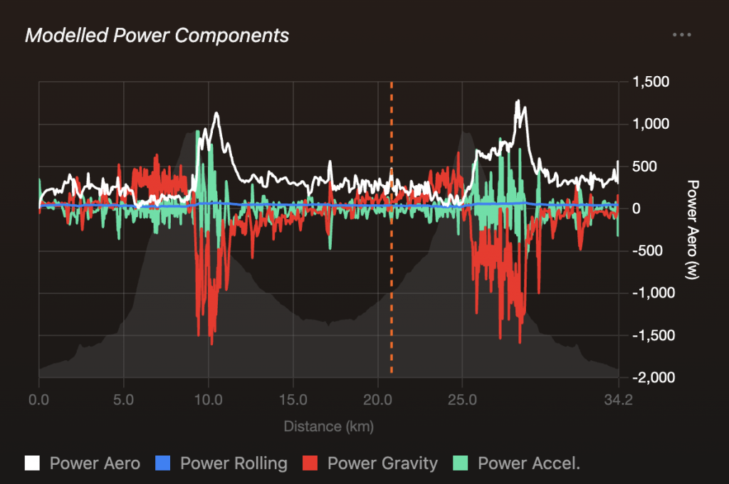
2. Modelled Power Components
The modelled power components graph is a revamped version of a plot on the old myWindsock platform. It tells you which component of resistive forces are slowing you down out of aerodynamics, rolling resistance, gravity and acceleration. It tells you how many watts you need in order to overcome that resistance. For example, you can see where the gravitational force goes way below 0 – this coincides with the course going down hill.
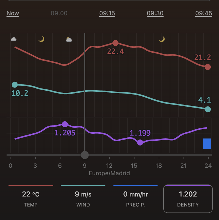
3. Conditions Evolution
This graph is visible to you in the top left hand side of your screen. It shows you how temperature, wind, rain and air density evolve throughout the day. This is good for both deciding when to leave the house for your ride, as well as checking if you’re disadvantaged with your start position in a time trial.
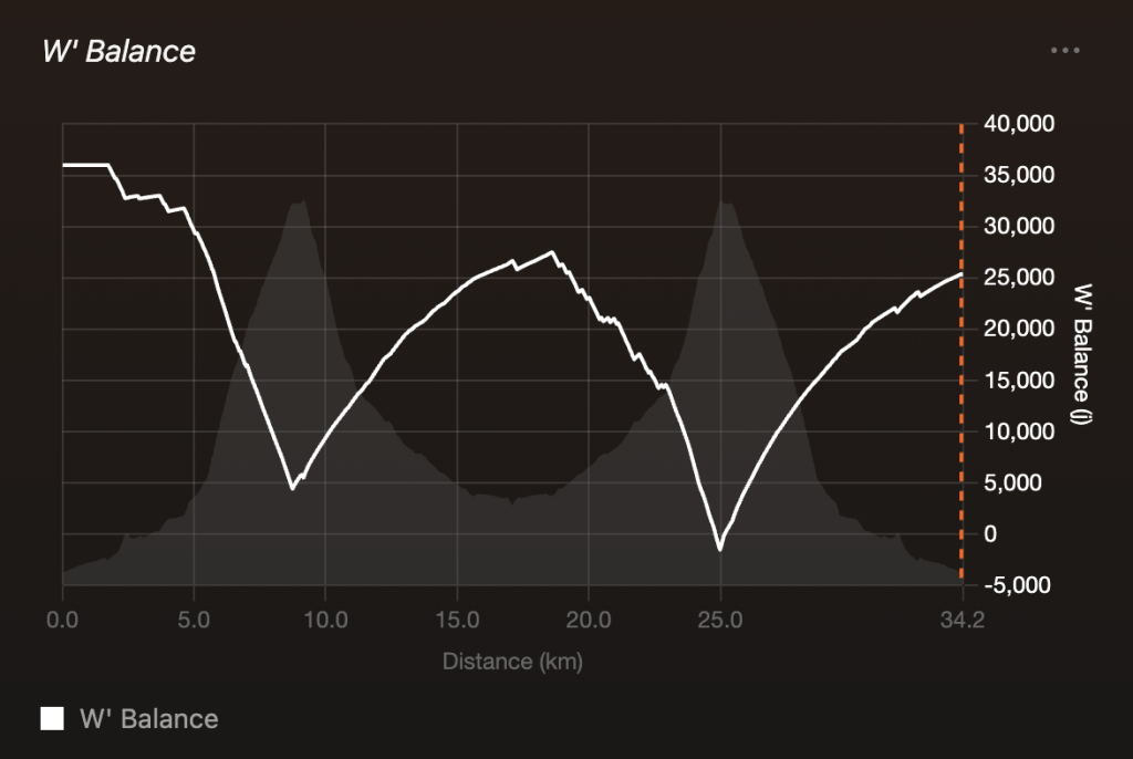
4. W’ Balance
This is another revamped plot from the original myWindsock platform. It tells you how much energy you have during a time trial when it comes to going over your threshold. When you go over threshold, you deplete your W’ which takes time to re-charge when you go back under threshold (for example, a period of you not pedalling on a descent).
5. Adding your own
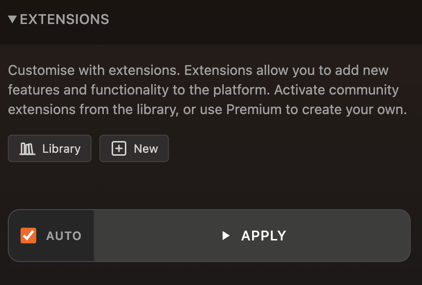
A key feature of the new platform on myWindsock is the ability to add extensions. As part of these, you can add the output of these extensions as graphs and add them as custom data panels.
There are significantly more than 5 plots and new features on the myWindsock surface platform. If there are any there that we’ve not explained, myWindsock will explain it for you.
The “Explain This” button can be found beneath every graph, where myWindsock’s AI will explain every aspect of the graph.

 UK Time Trial Events