
 UK Time Trial Events
This week we have a few updates that we hope you will enjoy.
Category: Discussion
Highlighting and discussing events in cycling and using myWindsock to improve performance.
Troubleshooting CdA
-
Your CdA is measuring too high or low
This is a common one and usually simply resolved or explained. These are the possibilities
- You are using ‘Loop’ mode.
‘Loop’ mode requires minimal braking to be a true calculation of your CdA. For general riding ‘Dirty’ mode is more suitable as this attempts to filter out braking and anomalies. - Your Performance Profile has errors in it. As part of the CdA calculation weight and rolling resistance are important. If these parameters are far from their true values your CdA will be incorrection. Check that you have entered in your combined weight with bike, clothing etc. CdA calculations are especially sensitivie to incorrect weight inputs for hilly rides.
- You dragged your brakes down hills. This is very difficult to separate from non braking data as there isn’t a large enough difference to create outliers to filter. Especially when there are long descents.
- Your brakes were dragging on the rim.
- You didn’t calibrate your power meter or it received a bad auto calibration during your ride.
- You were wearing unusually baggy clothing such as a rain coat.
- You are using ‘Loop’ mode.
-
No CdA displayed for my ride
- If you don’t upload power data to Strava we can not calculate your CdA. If you want to protect your power data. Try uploading the TCX file directly to myWindsock.
- Ensure your are still in Analytics mode. Go to > Mode
-
Some of my test Loops are missing
- When doing field testing ensure you have the highest position recording setting on your bike computer. For Garmin devices this is ‘GPS + GLONASS’.
- Experiment with the detection sensitivity. Lowering the Loop Tolerance will detect more loops but be increasingly less accurate.
> Aero > Loop Tolerance
-
My CdA is very different from my previous rides
- If weight, rolling resistance or drive train loss parameters are changed your CdA will also be different. Keep an Aero test profile that keeps this values the same to help compare CdA from ride to ride.
- Incorrectly calibrated power meter.
-
Only a small section of my out and back Time Trial has been measured.
Expand the minimum loop distance to capture a greater proportion of your time trial. > Aero > Minimum Loop Distance
Santos Tour Down Under
Find each stage of the Santos Tour Down Under preloaded for easy access. Each stage has a full forecast giving you a powerful insight into the action.
What to look for
- Echelons. Purple wind lines when the winds are strong offer the potential for echelons to be formed.
- The heat. 30 plus degrees centigrade temperatures will affect some riders more than others.
- Headwinds. Headwinds will always favour the Peloton. The aerodynamic advantage is too great when the winds are strong for breaks to succeed. Smaller riders are more likely to suffer greater during headwind sections than the larger riders.
- Tailwinds. A tailwind may provide the launch platform for a winning break. The reduced wind speed reduces the aerodynamic advantage that the peloton has.
View the weather for each Santos Tour Down Under stage here.
Why are wWatts higher in the Winter?
During the Winter months your may notice that your wWatts (weather watts) are higher than those you have been seen in the Summer. The main reason for this is Air Density. Colder temperatures bring us higher Air Densities, which means greater air resistance.
 What is Air Density?
Air Density is the mass of air in the atmosphere measured in kg/m^3. As the mass of air increases so does the resistance we experience when traveling through it. Here’s an interesting video demonstrating the affects of temperature on Air Density.
Why does this affect wWatts?
We anchor the wWatts metric to an average air density. So as above average Air Densities are experienced when it is cold in the Winter the resistance and therefore Watts required to achieve the same speed.
Low Air Density also explains why PBs are often achieved on warm humid days at the Summer.
New Dashboard View
Premium members can now start using the new Dashboard View. This provides an overview of the weather you have ridden in. There are many charts available including Highest Average Windspeed, Wettest Rides and Hottest and Coldest temperatures.
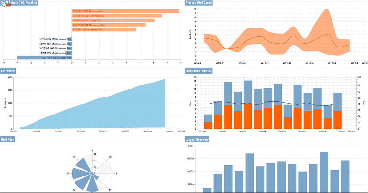
This is currently a Beta release and therefore we are expecting some troubleshooting. If you would like to provide feedback please contact us.
New chart helps you compare setups
The latest chart to assist you in going faster on your bike is the ‘Delta Compare’ chart. When making pacing changes or alterations to your setup that involve a compromise between power, weight and aerodynamics, it can be useful to view how these changes affect our times in comparison to the original setup.
This is perfect for viewing the advantages and disadvantages between Road and Time Trial bike setups. View the time gains from lighter more powerful positions over a heavier, less powerful but more aerodynamic setup. Can your riding style assist in offsetting the time losses on certain parts of the course?
The new Delta Compare graph shows all this by displaying the time gains and losses.
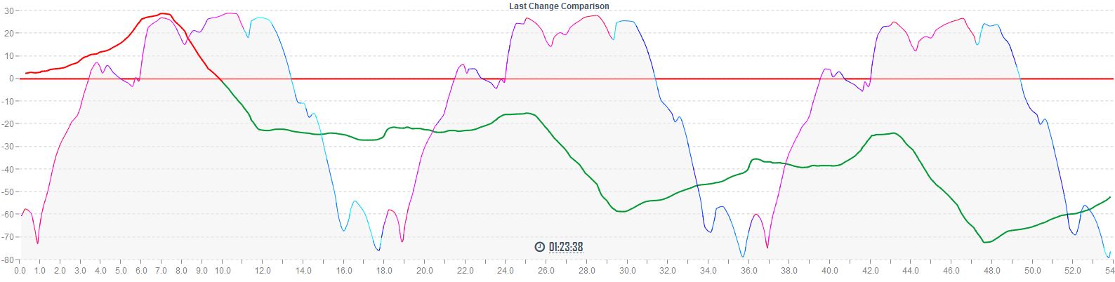
This is a Premium member chart, view all benefits of Premium membership here.
Experiment with pacing with the new Interval function
The latest feature for Premium Members is the facility to draw intervals on forecasts. This is fantastic for experimenting with pacing strategies. You can experiment with more power on the up hill sections and less on the down hills. Pressing on in the headwind and backing off in the tailwind. Perhaps change your aerodynamic drag on sections where sitting up or standing on the pedals will be required.
Aside from coming up with best power plan for your forthcoming race how about taking your Virtual Partner out on your next interval training session. Simply draw on the intervals, download your Virtual Partner to your GPS device and get out and chase after your VP.
Learn more about creating intervals.
Recent chart update
You may have noticed a change in the appearance of your myWindsock charts. I hope you like the change. The new chart system is far more flexible than the previous version allowing for new and exciting functionality that I will give detail on soon.
With any major change like this I am expecting there to be gremlins to iron out. If you spot something please let me know.
Some features of the new charts you can enjoy right now:
- Zooming: Drag or use the Zoom buttons to get closer detail to sections of a forecast.
- Smoothing & Sampling: For speed and clarity you can now change the smoothing of charts
- New chart ‘Ground Speed Distribution‘
- Wind Lines now illuminate the elevation chart for improved context
- Route reversal, any route can now be reversed
- New metrics including Total Rainfall
The new chart system allows greater interactivity and with this the possibility for improved forecasting. Stay tuned for the next big update.
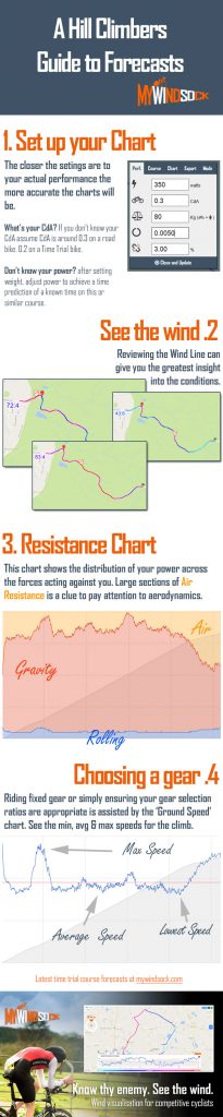
Hill Climbers: Using our forecasts
The wind can completely alter a Hill Climb effort adding or subtracting minutes from the climb. This makes judging the effort and choosing a gear if riding fixed challenging.
If you plan to ride fixed and you have estimations of Power, Weight and CdA. Take a look at the Ground Speed chart on hill climbs to assist you in picking the correct gear. The average, min and max speeds will help you judge gear choice.
Here’s a quick infographic on how to set up your chart and use the basic functions of a myWindsock forecast to get the best foresight for your hill climb event.