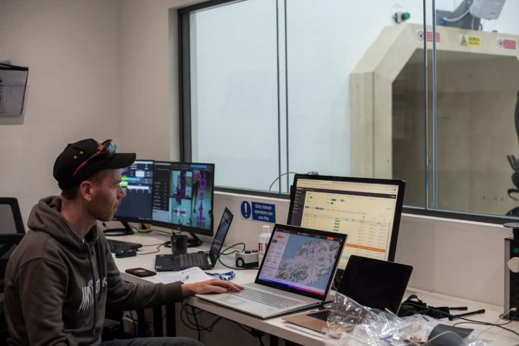
We often neglect to highlight our own features here at myWindsock and one thing that we don’t talk about enough is our trends dashboard, what these charts mean and how to use it.
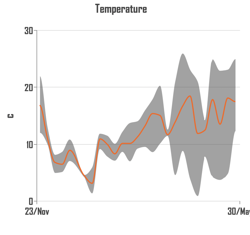
Temperature over time
This plot shows you how the average temperature of your weekly riding changes over time, as well as the range of temperatures that you’re riding in. You can spot that, for me, April and May were months where it was tricky to get my layers right!
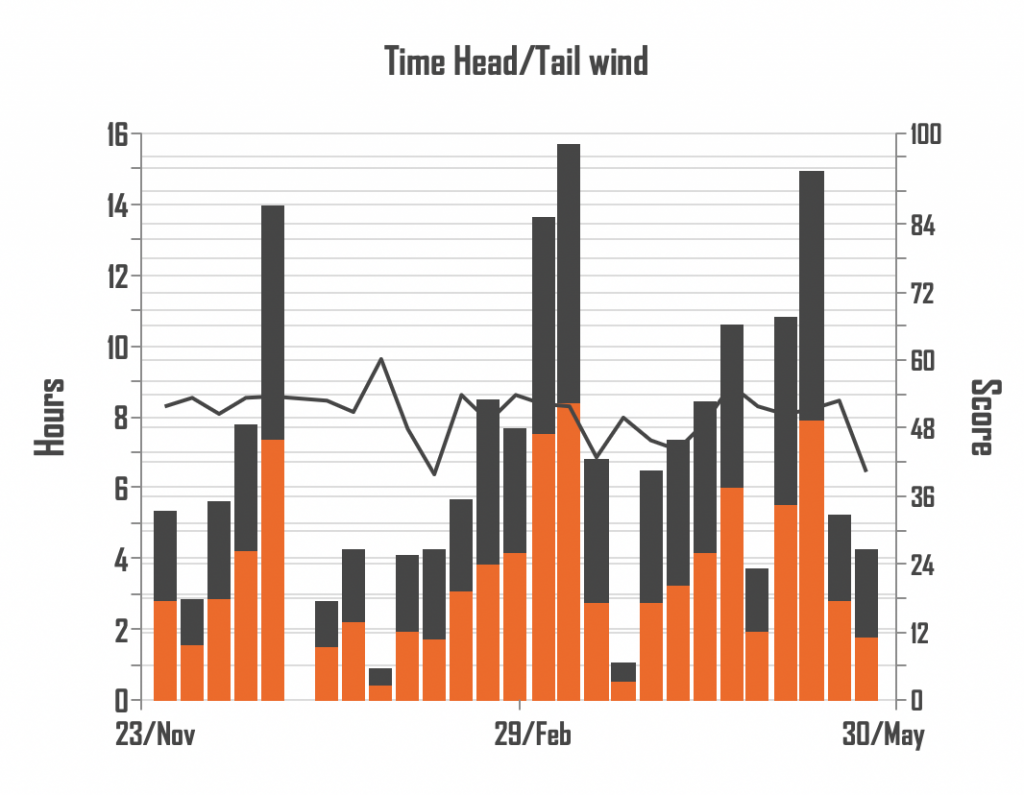
Head wind vs Tail wind
Some weeks just feel like you’re riding against the wind all the time but, according to this graph, it’s only half the time… Reassuring to know I don’t have constant headwinds though.
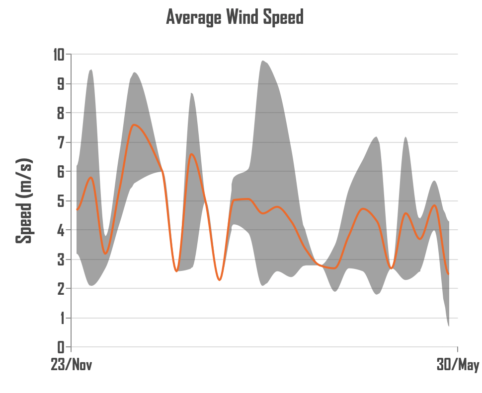
The average wind speed plot
Interestingly, you’ll notice as the temperature began to swing more wildly for me in April and May, the wind died down a little. My average wind peaked in December (I was in Belgium for most of December, so that doesn’t come as too much of a surprise for me).
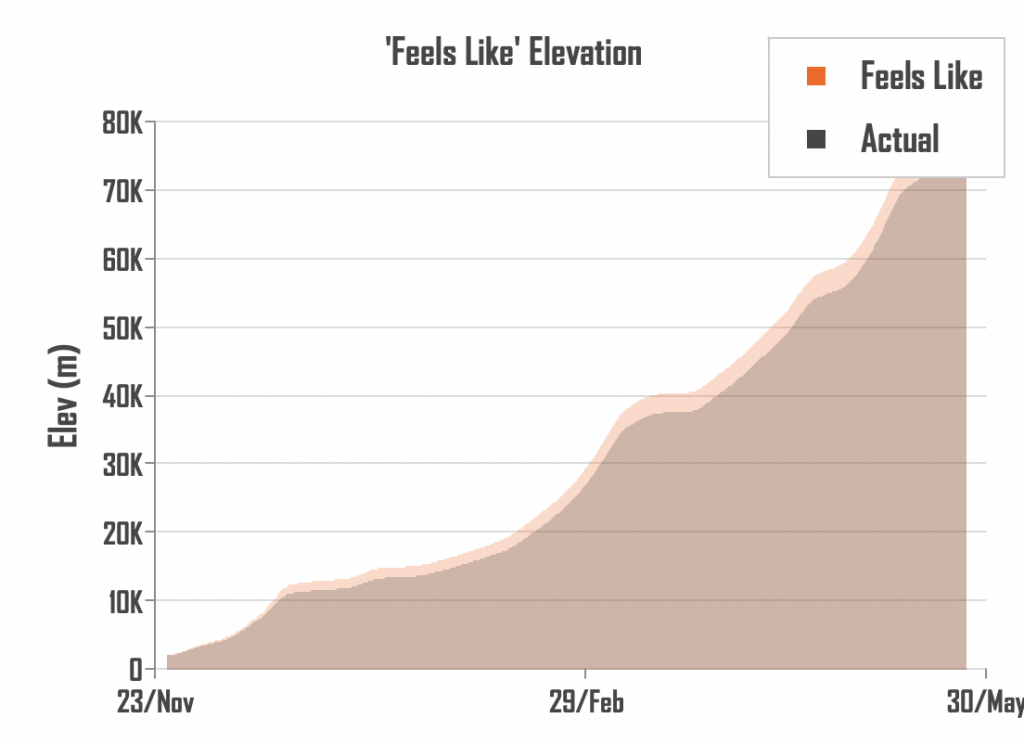
Cumulative “Feels Like” Elevation
This plot shows how my feels like elevation has been increasing since I started back training again. It basically just adds each week onto the last and you can see the culmination of the work that you’ve done against the wind and gravity.
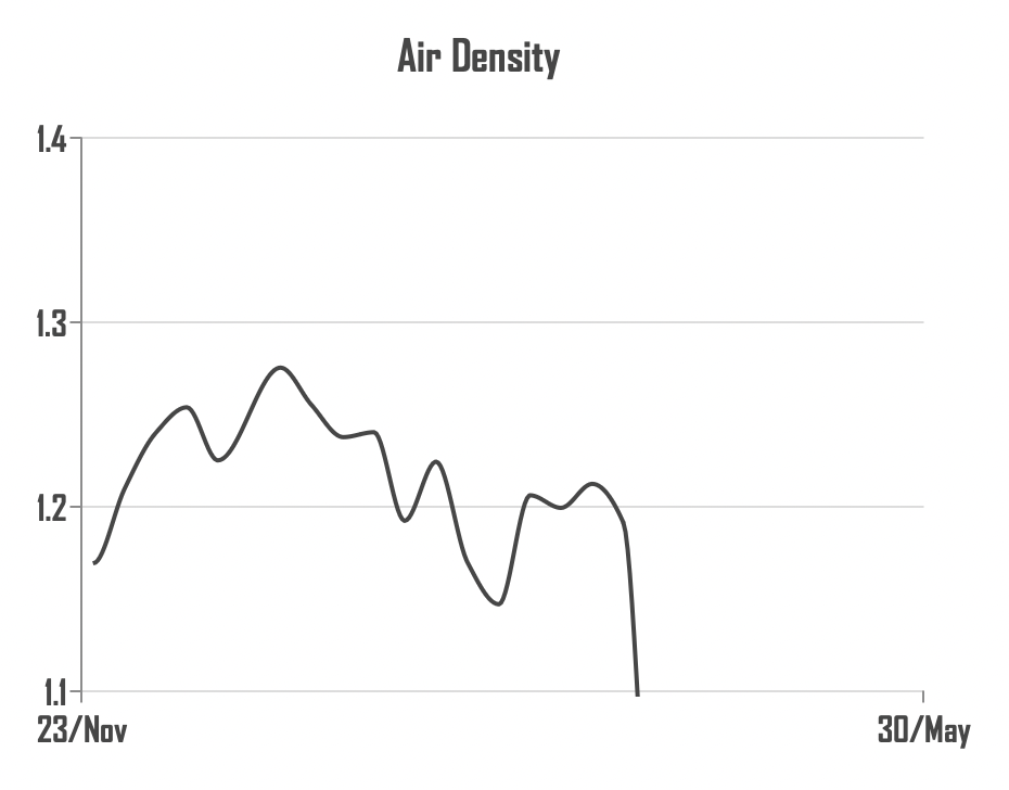
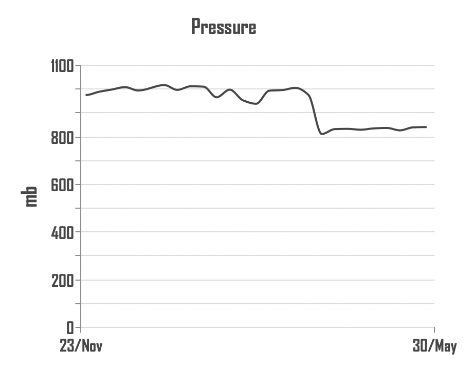
Can you spot when I went to altitude?
As you go up, air pressure and density both drop. This change is pretty marked. In early April I went to Andorra and have been staying up at 2100m above sea level. You can see the impact this had on air pressure, density and the range of temperatures that I faced!
For insights like these into the weather you train in, or to get ready for your next race, sign up to myWindsock here.