


There is so much data, sometimes it can be a bit overwhelming! So let’s break things down a little and get you started. Before we do anything, you’ll want to sign up or log in – click here to sign up. To add myWindsock as an app for your phone, click here.
Loading a route into myWindsock
From the Dashboard you will see an Activities & Routes button. This will connect you with third party mapping services like Strava and Ride With GPS. You can also find this button in the main menu. Simply click this button and follow the steps.
For an in-depth tutorial on how to load a route, click here.
Let’s look at a forecast!
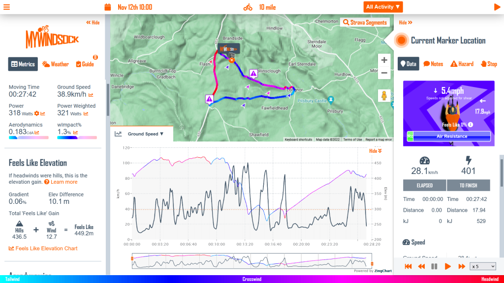
Once a route is uploaded, we want to create a forecast. This will allow us to see wind direction, rain and temperature across our ride. On top of the weather metrics, we can also view performance related information on forecasts. Here’s an example forecast Friday 12th November 2021 -10am.
Finding Key Moments
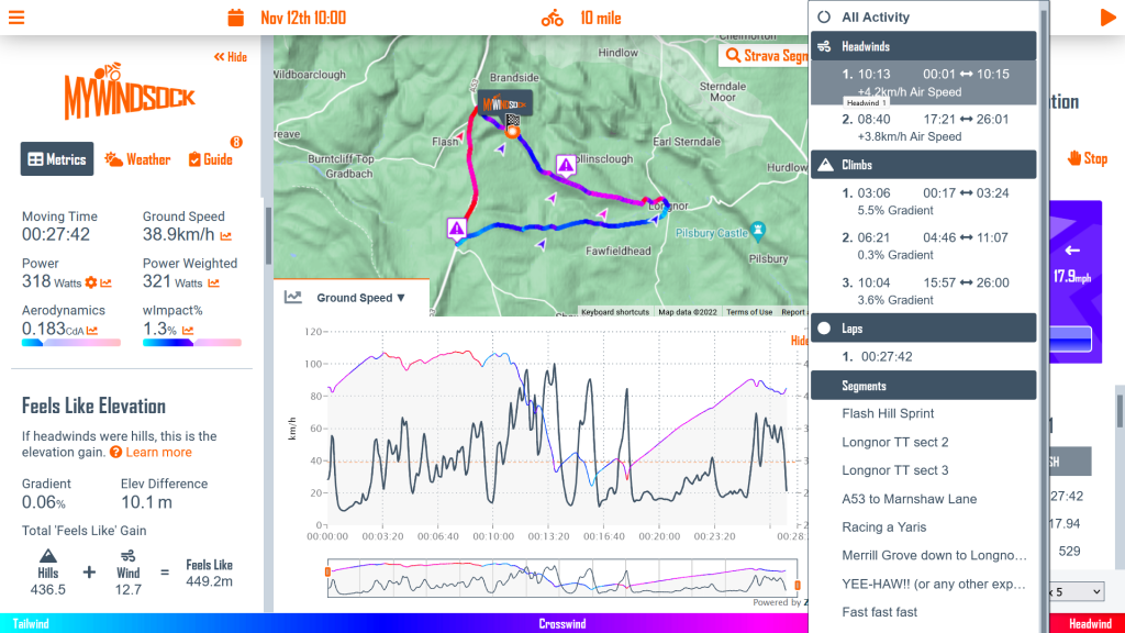
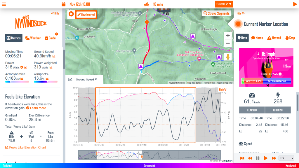
The Course Navigator highlights areas of interest on the course, including headwind, climbs, and Strava segments. Also found in the Navigator menus are any intervals you have created.
How should I use a forecast?
Using a myWindsock forecast is a great way to get more out of your riding. It can be used for a number of reasons including but not limited to…
- Planning what to wear on a ride
- Planning where on the route to do your intervals
- Planning when to stop in the cafe
- Planning a route that’s more tailwind
- Performance analytics and pace plans
- Segment hunting
Windsock provides a wealth of information to users. So much so that it can feel overwhelming at times. Breaking down and digesting this information can be difficult. Click here for in depth explanations of all the metrics used on myWindsock!