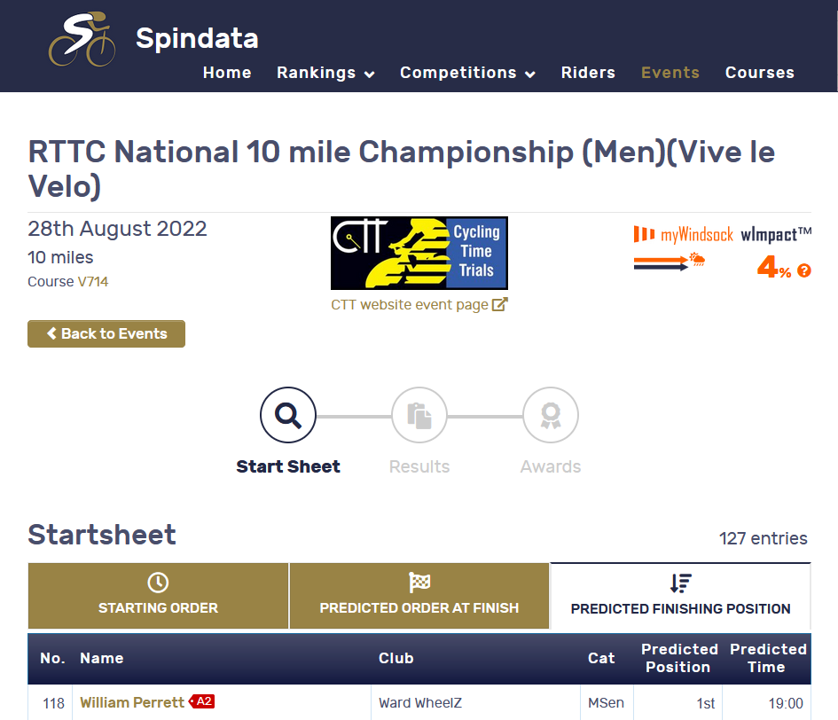
We’re delighted to announce, the talented statisticians behind the official Cycling Time Trials ranking system, Spindata, have incorporated the myWindsock Weather Impact ™ metric into their event pages. This is using the myWindsock Metrics API. The API enables third parties to add myWindsock course data to their websites and applications.
To improve pre race preparation, we have developed a few additional features for your forecasts. These features are Desktop and Tablet features.
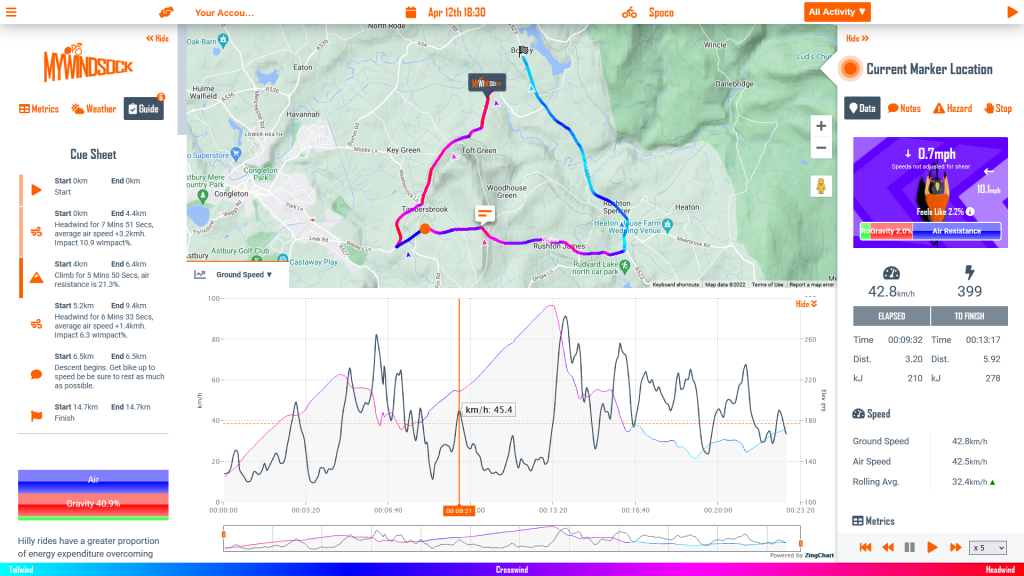
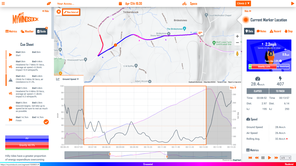
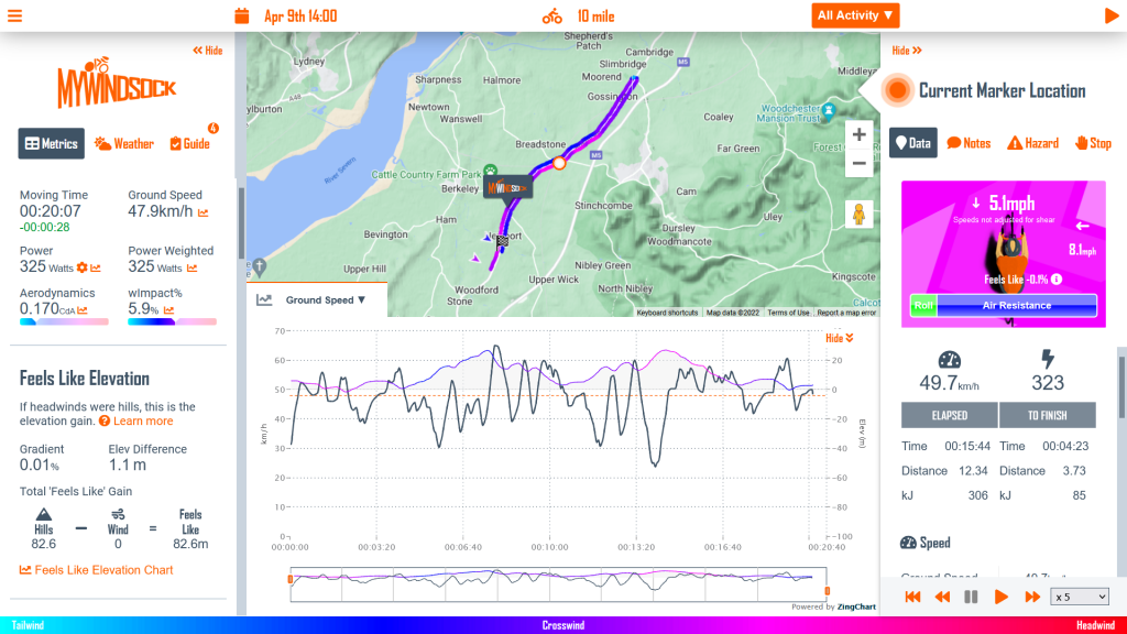
Cue Sheet Markers
Markers at the side of the Cue Sheet display where your Virtual Athlete is up to.
The Cue sheet will indicate which Cue Item is currently active based on your current Virtual Athlete’s location. Update your Virtual Athlete’s location by clicking on the map Windlines, hovering over the active chart, or by playing the activity.
Your Cue Sheet is now Interactive
Clicking on the Icon next to a Cue Item will highlight or zoom to the region on the forecast. Use this to view an interactive breakdown of the activity.
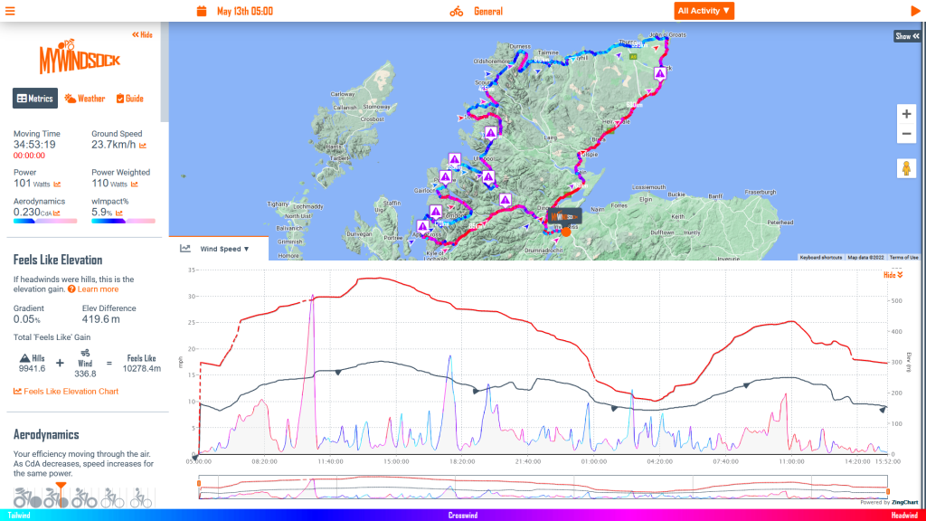
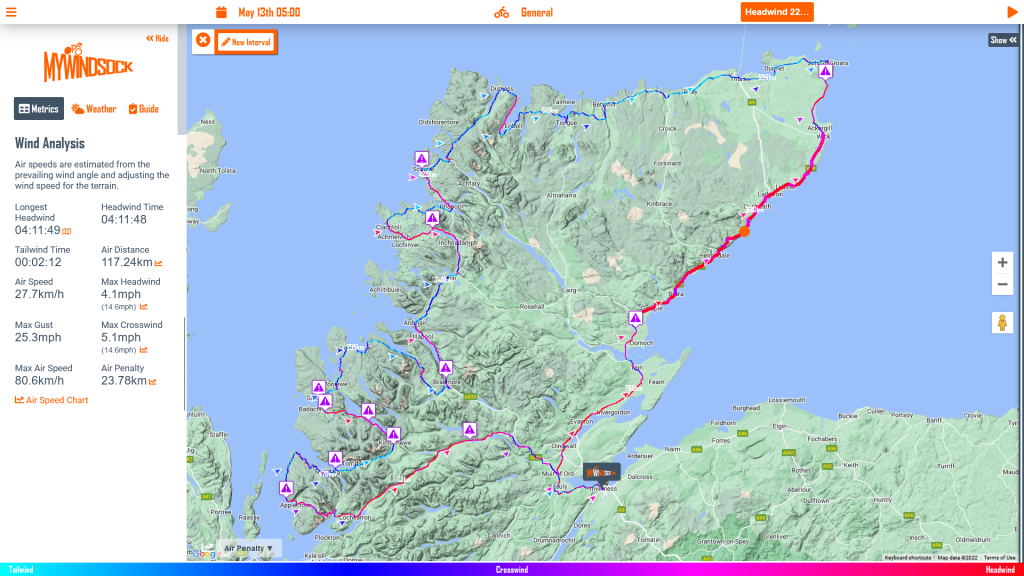
The Lands End to John O’Groats record holder, Christina Mackenzie is taking on another formidable test of endurance. On Friday 13th of May, she will be attempting to set the a new North Coast 500 record. The 500 mile route, around the Scottish Highlands, climbs a huge 10,000 metres. That elevation gain is more than an everesting attempt!
In prepartion for the event, Christina and her team have been monitoring the myWindsock forecast. RRA record breakers, are using myWindsock forecasts to help understand the demands of record attempts. Here are few things that have caught our eye.
Power and CdA numbers are for demonstration purposes and not that of the record attempt.
Wind gusts up to 33.6mph
Wind Speed Chart
It’ll be a very windy record attempt. The purple triangles indicate potentially hazardous crosswinds. This may impact equipment choices for these sections of the ride. The wind will affect overall speed. It is anticipated that Christina’s average air speed will be 1km/h higher than her ground speed.
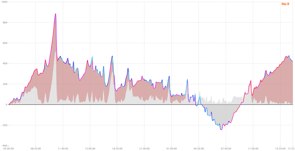
18hrs of Headwind
Highlighted Longest Headwind
Of the 18hrs of headwind we think the toughest section will be the 22nd Headwind of the attempt. This is 4hrs between Wick and Loch Fleet, happening from 7am, 26 hrs into the record attempt. The average forecast wind speed here is 12.5mph gusting to 23mph. Air Speed here will be on average 5kmh higher than her ground speed.
How will the ride feel
Feels Like Elevation Profile
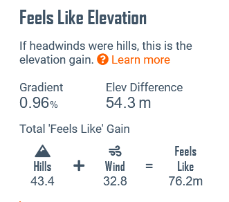
When we combine the wind with gradient we get a new perspective of road feel. We call this Feels Like Elevation. The red sections show how much greater the road feel has been overall due to the weather. After the summit of Bealach na Bà the areas of red begin to reduce indicating that the road feel has become easier, there is now assistance being provided by the wind.
In fact by 7am, 26hrs into the attempt, the weather will have been to Christina’s advantage. From this point however we see the Feels Like line begin to ascend and exceed that of the terrain. Eventually the weather will give an additional penalty of 434 metres Feels Like elevation gain.
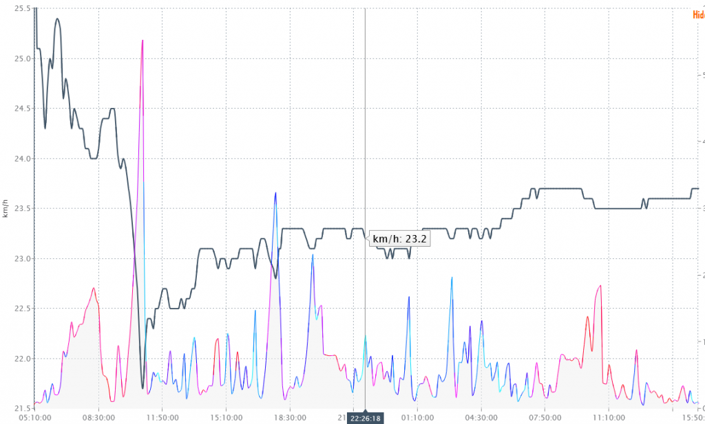
Speed Expectations
Rolling Average Speed Chart
Average speed can vary considerably during record attempts. Inevitably, when a rider sees average speeds are below what is required for the record, they can be anxious. The crucial thing is to have the data to support decision making. Have the data of rolling average speed throughout the record attempt, will give a far better indication as to whether a change of plan is required.
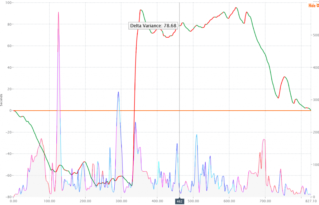
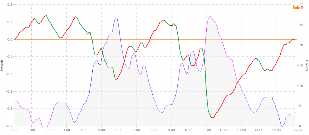
Where will aerodynamics play the biggest role?
Delta Variance Chart
With a quick experiment we can find exactly where Christina should be focusing on aerodynamics the most. We simply reduce her CdA by a small amount. Then, by viewing the Delta Variance Chart, we can see in Green the parts of the course her aerodynamics are most important.
We have no doubt Christina will be focused on aero throughout. However, inevitably on a 34 hour ride to be 100% locked into position is probably unrealistic. Therefore, the red sections offer some opportunity to stretch and relax, a little. Where as the Green sections indicate where it is very important to maximise aero.
Good luck Christina
We wish Christina and the team all the best of luck. If you would like to support Christina’s charity, you can donate to the Cruse Bereavement Scotland Charity through her Just Giving page.
We’re excited for the FTP Racing U7B time trial on Saturday 9th April. This is a quick look at some course dynamics. All charts are correct to the current forecast. We recommend viewing your own forecast, to see the most up to date course forecast and data. View the course and the forecast for Saturday here.
How the course will feel
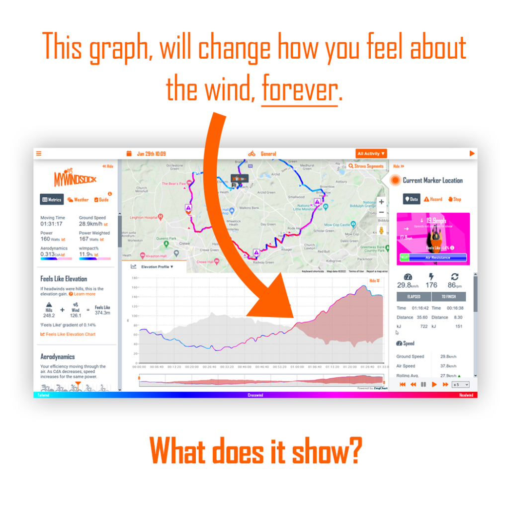
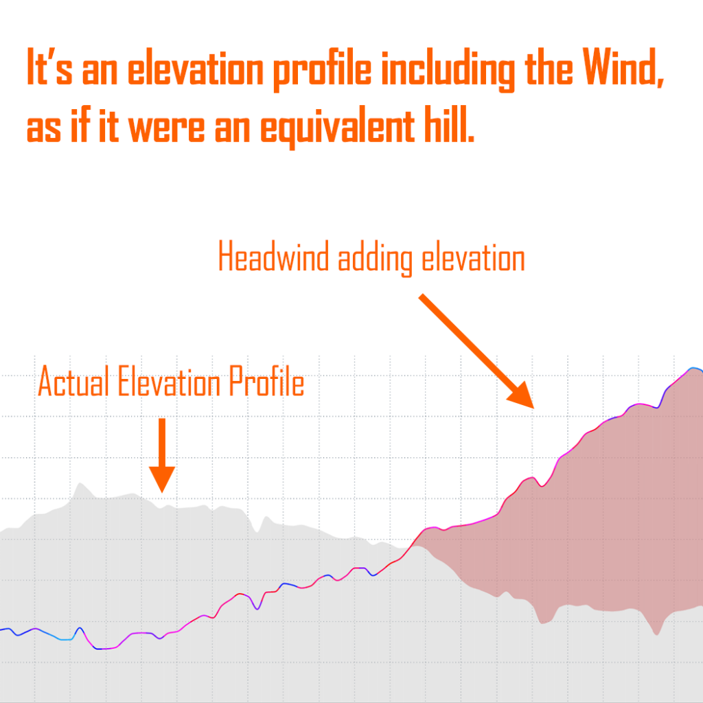
‘Feels Like Elevation’, helps us to visualise the wind in the same way as we would the elevation profile of a hill. We are equating the wind to the hills. Helping us to see how the wind would feel, by viewing it’s equivalent gradient. This helps us formulate our mental strategy for race day.
Below is the graph for Saturday’s race. The Westerly 10mph wind, is now combined with the elevation profile. The grey area is simply the standard elevation profile. However, the coloured line shows the wind and elevation together to give you a clearer idea of how the course will feel.
The red areas are showing that the wind has created harder feel than the original elevation profile would suggest.
Feels like elevation, when we factor the feel of the wind combined with gradient
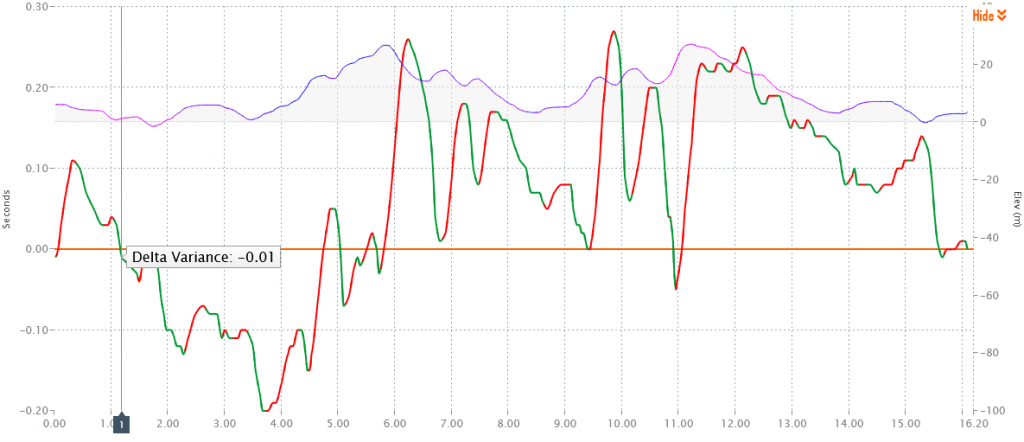
Where should we put more power out
We next turn to where the course will give us the most return, for a little extra power. The green areas of the line chart below shows were on the course we get the greatest return for each additional Watt. Pay attention to 3.5-6km, 9-9.3km and 10.75-11.25km, those locations will give you a good return on a slightly increased power output.
On the flip slide, the red section, will give you an idea as to where it would be less advantageus to increase your power. Looking at 11.25km to 14km, it wouldn’t be as efficient to increase power here. Better to increase the power in the preceeding 0.5km.
Where power has the greatest affect on time. Green shows where you get the most return for each Watt.
Where aero is most important
Next, where on the course does an increase in our focus on aero pay off the most. This is depicted in Green below. In red aerodynamics are having less affect on the overall speed. This is not to say aero is unimportant in these areas. This graph simply shows that if we were to increase our aerodynamic efficiency where along the course would that increase in efficiency give us the greatest return.
Where aero has the greatest affect on time
You can make your own experiments using myWindsock for all your time trials. We have all the UK time trials already preloaded for you. Simply visit our CTT Time Trial Forecasts.
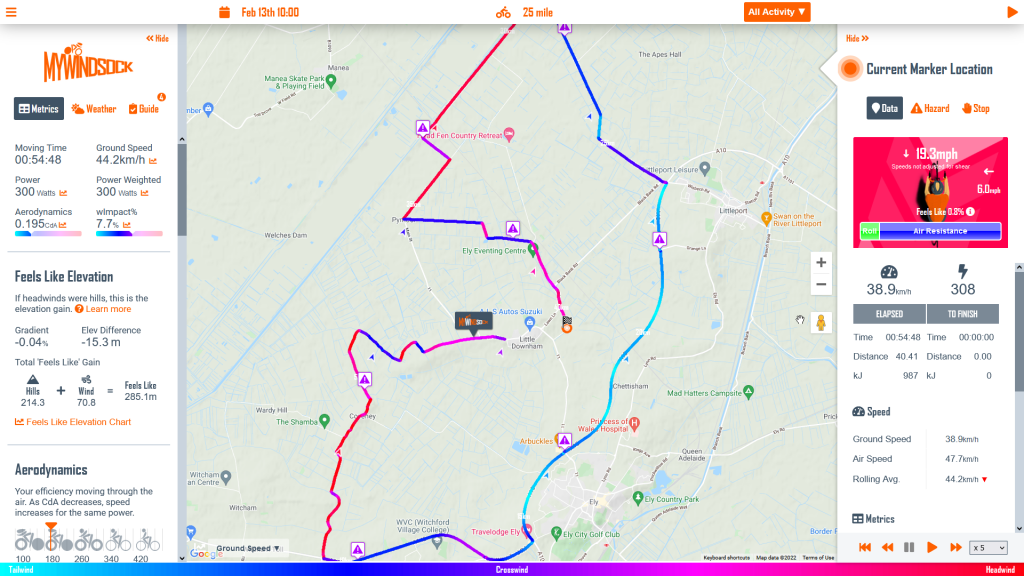
The 2022 time trial season is just around the corner. In this series, I’m going to show you how I would use a myWindsock forecast, to prepare for the first Cycling Time Trial event, the Ely & District 25 mile SPOCO on BS19.
PLEASE NOTE: Weather forecasts are updated hourly, this forecast may have changed from the time this article is published. View the forecast for yourself here.
In this first part we look at how understanding the challenges of the course weather so we can prepare a mental strategy. This is what we refer to as the Descriptive side of myWindsock. We are describing race day, so you have all the information required for optimal mental preformance.
In our second part we will look at the Prescriptive tools. We will show you how to formulate the optimal power plan.
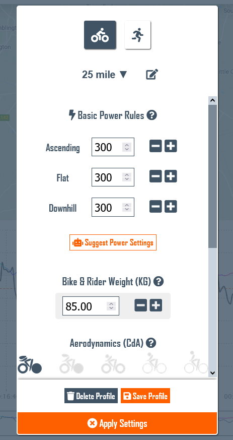
First thing, we need a Virtual Athlete to Ride the Course
We want to ensure everything we are looking at reflects our performance on the day. To do this, we need a Virtual Athlete (VA). Your Virtual Athlete will ride the course as many time as you like, with infinite setup choices. The beauty of your VA, they never get tired!
In the next part of this blog series, we will look at how to use your Virtual Athlete to formulate the best race plan. For now, we just need to have a good estimate of race day performance.
Clicking on the Bike icon for cycling events will reveal the Virtual Athlete menu and settings. Ensure this reflects your own performance.
You may want to create a new Virtual Athlete for this race distance, I have one simply called “25 mile”. I will use this as the basis to begin all 25 analysis and then, as we will learn in the next post create a race specific VA for the event when I come to plan power.
Pay specific attention to Power, weight and aerodynamics.
Often I am asked about what to enter for aerodynamics. You can use this post to find your CdA from a previous race activity. You can also use the icons to guide you. For time trials if in doubt use 0.200.
What to expect
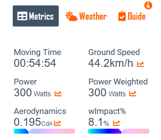
We start in the Metrics tab. My attention is initially drawn to the Moving Time and average ground speed. Notice that we refer to ‘Ground’ speed rather than simply ‘Speed’. This is because we also have metrics for ‘Air’ speed.
Power and Aerodynamics are as we have set for out VA.
Weather Impact is quite high at 8.1%. This tells us, for me to achieve the same time as on a weather free day, I’d require an additional 8.1% power. Find out more about Weather Impact.
General Summary
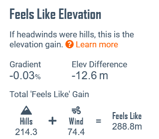
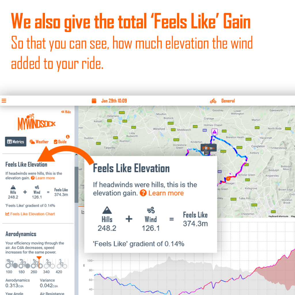
Moving down the metrics panel we have our Feels Like data. Feels Like gives us an alternative way to view the wind. We equate the wind to it’s equivalent gradient. Why? Well, I find it is easier to imagine a how difficult a gradient will feel. Whereas, the combination of prevailing wind direction, wind speed etc. is more difficult to imagine.
Our Feels Like Elevation panel
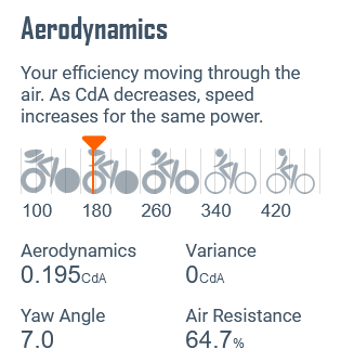
Next, we move down to the Aerodynamics panel. There are two pieces of information we should be aware of. First is Yaw Angle. This is the average Yaw, we have a chart showing the Yaw distribution, to help make informed equipment choices. I have a couple of wheelsets and some technical data on them that gives me the best operating Yaw angles.
Also in Aerodynamics we have the Air Resistance. This is the percent of your power absorbed by air resistance.
Weather Overview
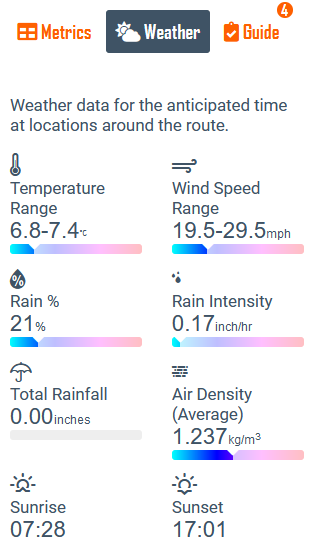
Our Virtual Athlete has now collected data at the correct speed. So now the data will reflect the correct time and locations for our weather data. Let’s take a look under the Weather Overview.
The above numbers are an overview of the data collected from around the course. It is forecast to be a chilly ride with strong 19.5mph average wind speed, gusting up to 29.5mph. Some rain may be present.
The headline from the forecast has to be the 20mph plus wind, so our next stop is to see where that wind will be on the course. We head to the Course Navigator.
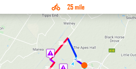
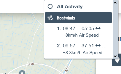
Finding the Headwinds
First thing we note is that there are no significant climbs listed. However there are Headwinds.
Two headwinds are brought to our attention, each around 9-10 minutes in length. The first starts 5 minutes into the ride, then the second almost 38 minutes in. We also note the additional 8km/h air speed, this is quite significant. Why 8km/h. We calculate this additional air speed from the prevailing wind angle, wind speed and wind shear, which is the slowing of the wind close to the ground.
To see each headwind we simply click the headwind we are interest in. This highlights the headwind on the course so we can visualise where to expect the wind to start and finish. This also creates metric summaries for the selected portion of the ride.
First Headwind 5 minutes from the start, lasting just under 9 minutes.
How to use this data
Why do we need this information? By understanding how the headwinds will affect our performance, we can create an effective mental strategy.
What usually comes into your mind when racing through a headwind?
I’ll tell you what comes into mine.
Sometimes, I can be defiant, “I’m not going fast enough”, “I need to push harder”.
Then there is, “this sucks”, “I’m having a bad race” and “today’s not my day, I don’t have the legs”.
Non of these thoughts keep us in a calm high performance mindset and are likely to sabotage a race performance. To combat these thoughts we need facts as our weapons. This is where our analysis goes next.
By being mindful during a race we can discover what information we need to have. This is personal to you. However, I will outline from my experience what helps me.
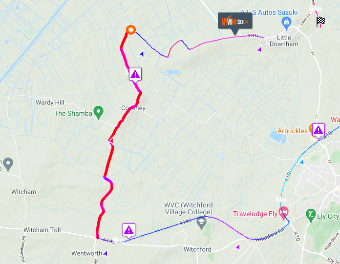
When and where to expect the headwind to start. Use the map and the Course Navigator to ensure we know the start position.
Know what the affects of the headwind will be
Check the Average Speed Graph. How much does the speed rise all fall during the headwind. This helps with any thoughts around not going fast enough.
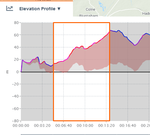
View the Feels Like Elevation chart to visualise how the headwind relates to gradient. You may find it helpful to imagine this theoretical hill you are climbing. Imagine the summit to be where you know the headwind finishes.
Know where and when the headwind will finish
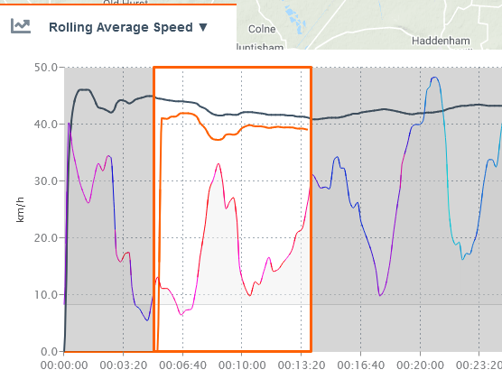
Rolling Average Speed. The Black line indicates the overal ride’s average speed evolution. The orange is the rolling average for the highlighted section.Feels Like Elevation Profile. The grey section is the actual gradient. The red section and coloured line depicts the Feels Like elevation gain due to the wind.The Feels Like Summary for this headwind. It will have an average gradient feel of almost 1%.
We repeat the above for each of the significant headwinds. The crucial part of this planning phase, what we call the descriptive phase, is to minimise the unknowns. I think of it this way, if we were tennis players we would expect to know what court surface we would be playing on. The weather poses as much of the race day challenge as the distance and terrain.
In our next post we plan the optimum power strategy.
Why view the wind this way? It’s all about putting our efforts into context. Gradient, is far better understood than wind speed combined with it’s prevailing direction. The better we can relate to the challenges the course gives us, the better we can plan our efforts and understand our past performances.
You can learn more about Feels Like elevation, here.
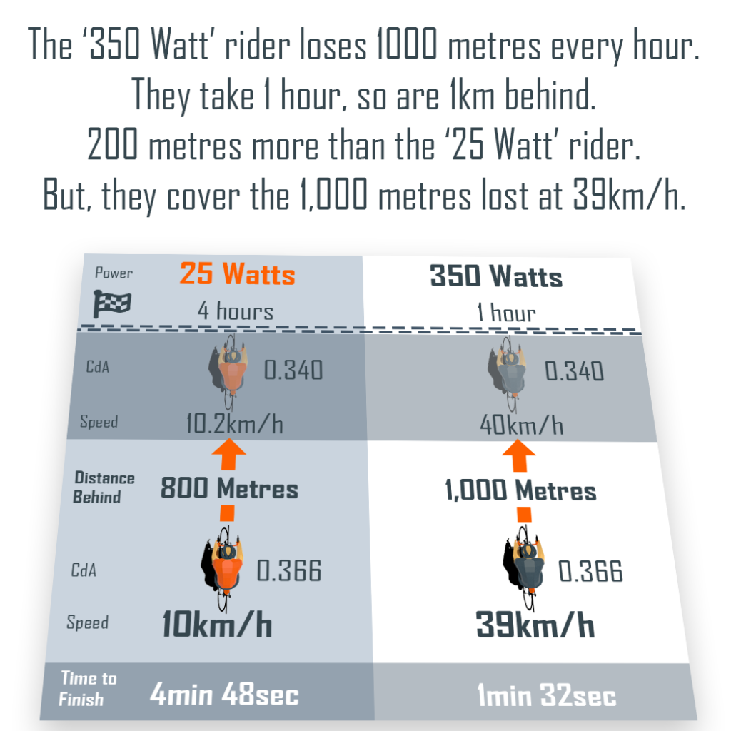
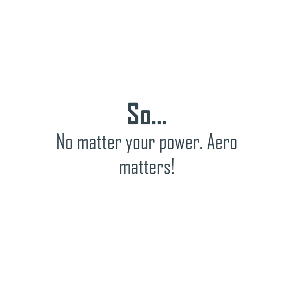
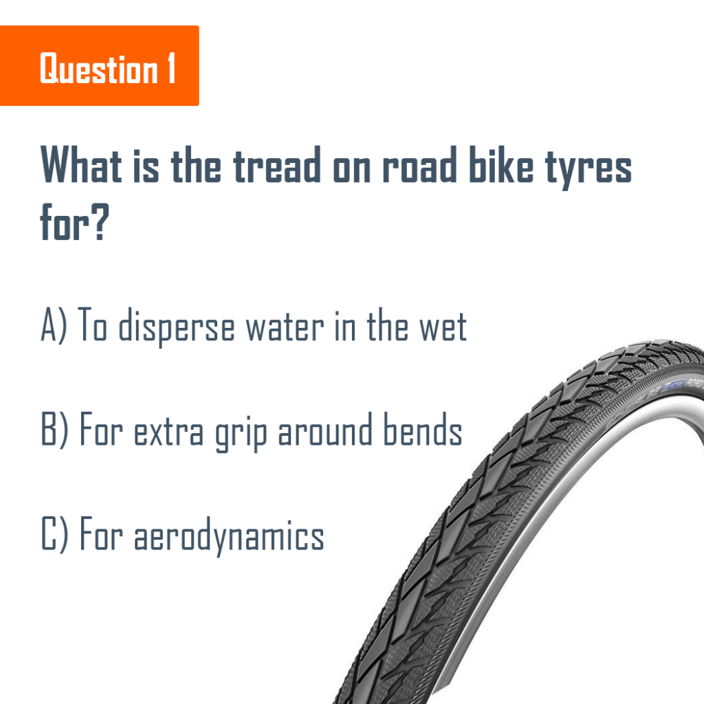
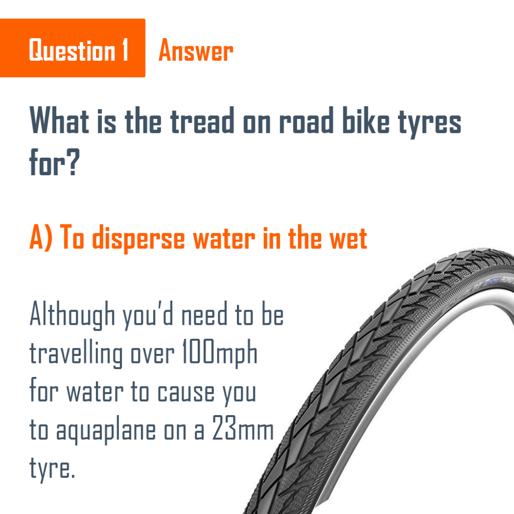
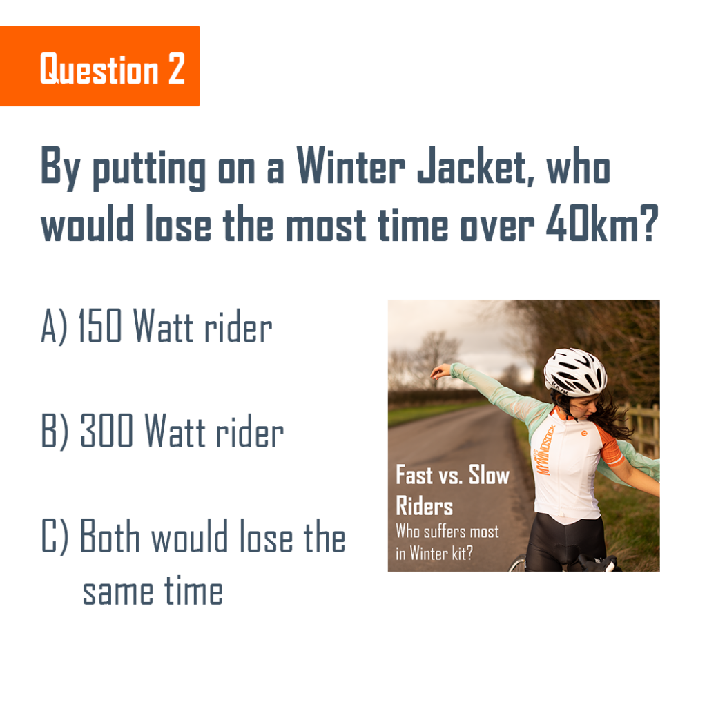
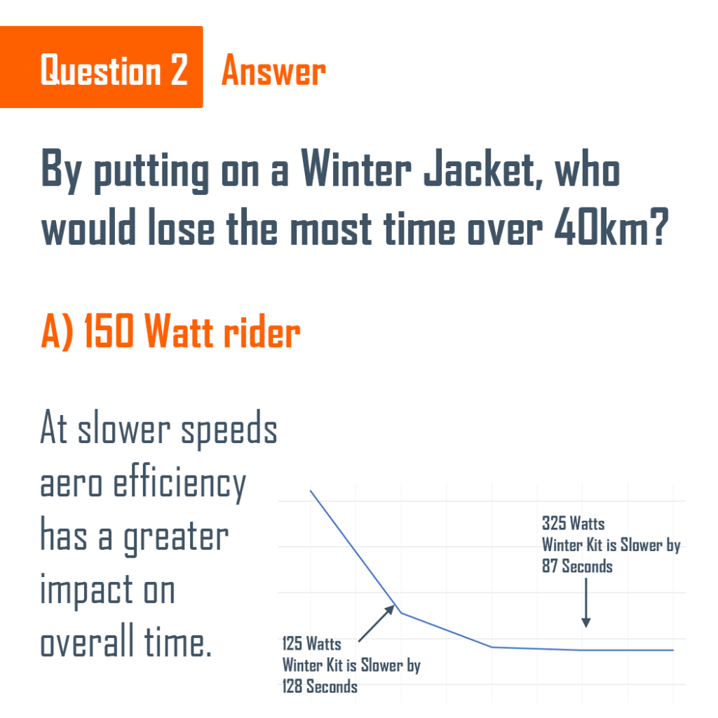
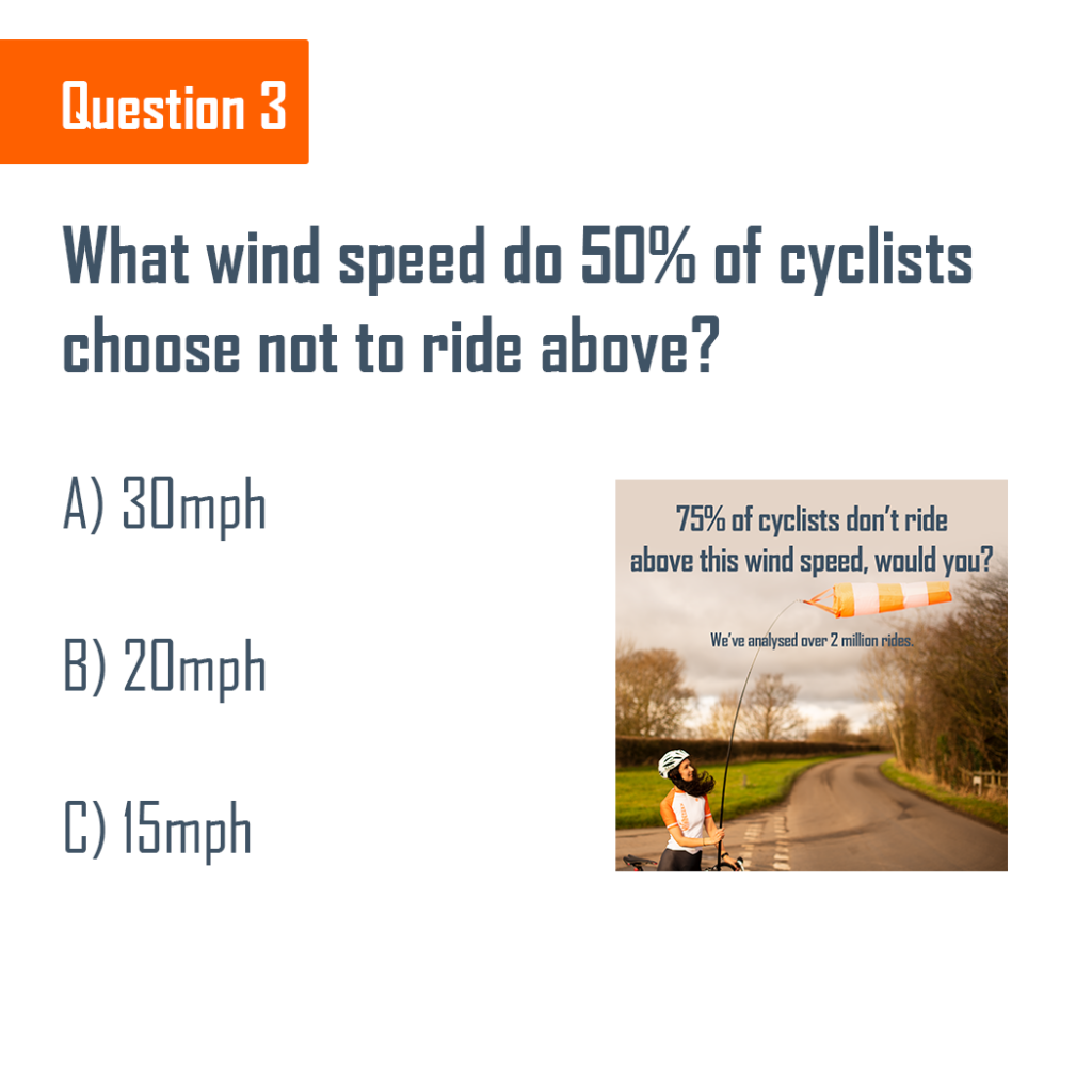
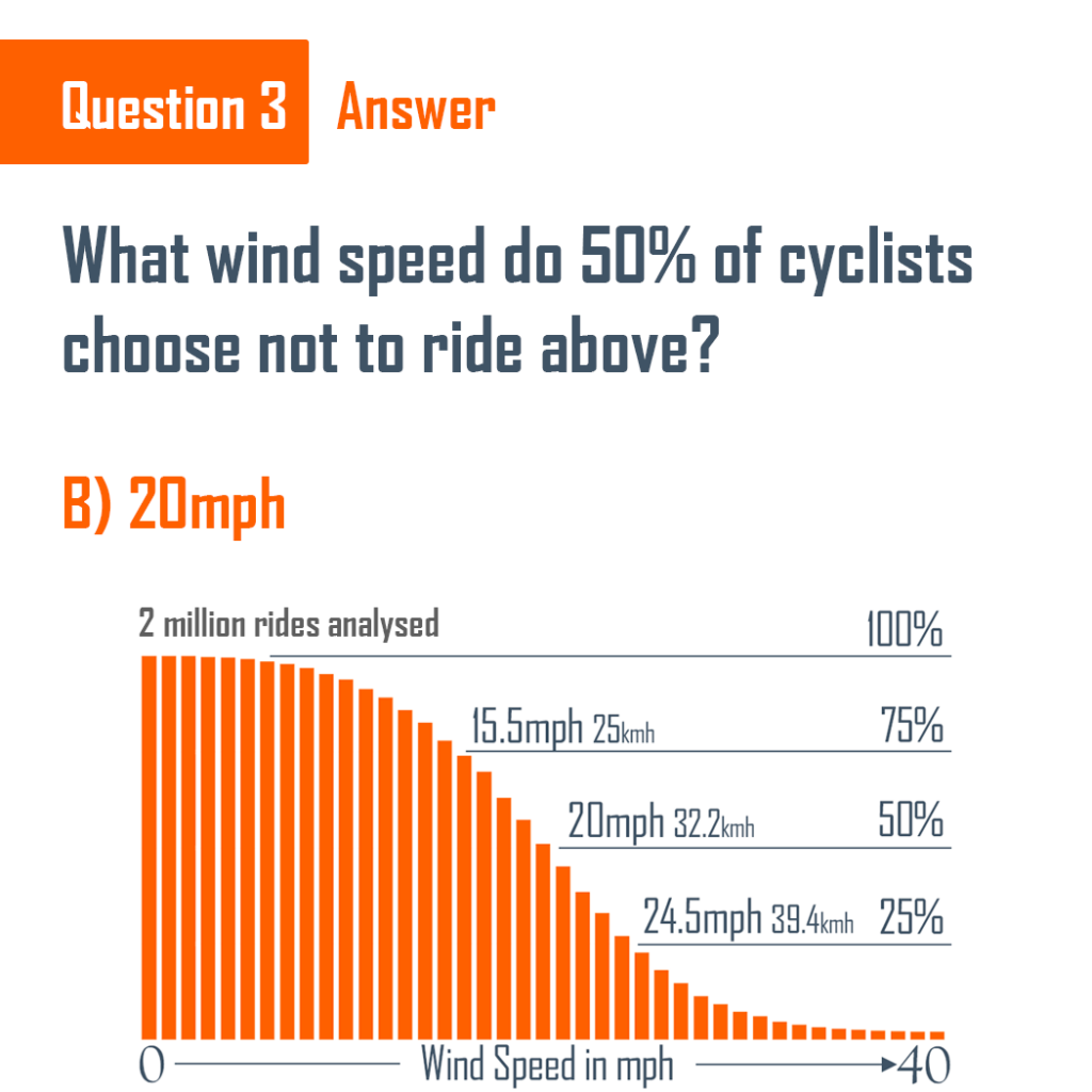
As Winter rolls on, we thought a short Winter cycling quiz would be fun. We’ve thrown in a couple of our latest facts about Winter riding, so we hope you’ve been paying attention. If not, check out our Instagram or Facebook for some cool Winter cycling analysis.
How many did you get?
Would you want to learn more about Cycling efficiently in all weathers? Make sure you are following us on Instagram, Facebook or Twitter.


 UK Time Trial Events